Data doesn't always have to be 'big data' to be interesting. For example, I recently ran across a small, but very interesting, database containing all of North Korea's missile tests. The data was a bit difficult to digest in the formats provided, therefore I decided to try my hand at making some improvements. Follow along as I (hopefully) help make this data much easier to understand...
Table
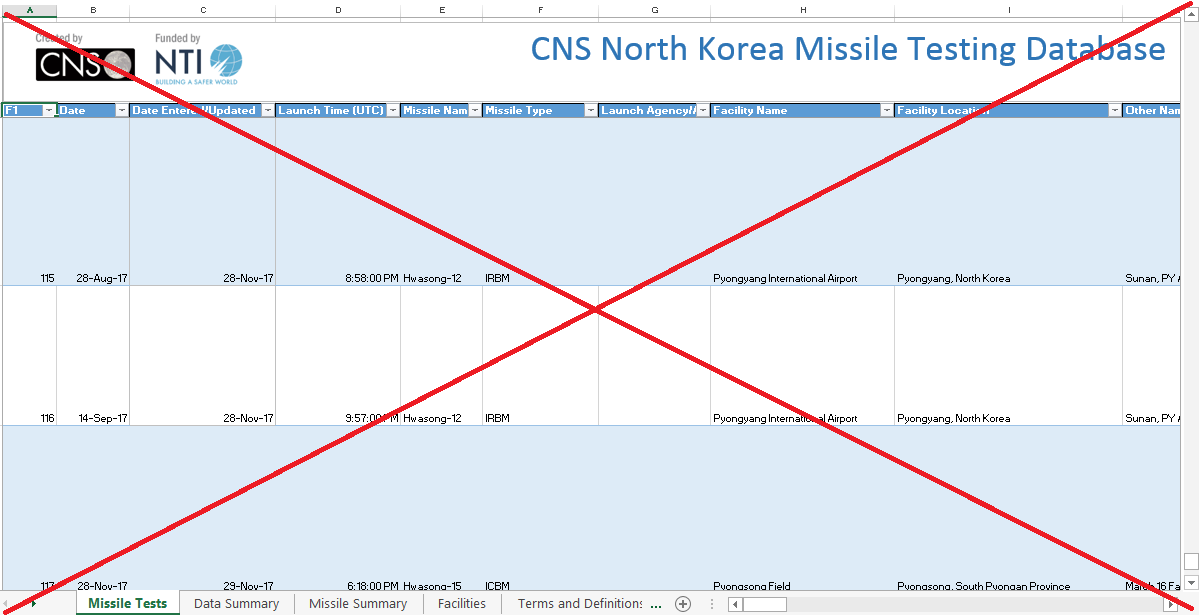
I found this data on the Nuclear Threat Initiatives (NTI) website. They allow you to download the data as an Excel spreadsheet, which is a good way to distribute small databases. I downloaded the spreadsheet, but found it a bit difficult to view - some of the cells contain long text, which causes it to show only a few rows & columns at a time. Without tweaking the spreadsheet, here's a screen-capture of a portion of it:
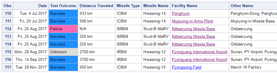
I imported the spreadsheet into SAS using Proc Import (dbms=xlsx), and used Proc Print to create my own table. Rather than trying to show all the values, I picked the ones I felt were most interesting. I also color-coded the Test Outcome, used a more 'friendly' date format (adding the day of week), and I made the Facility Name a link to the Google satellite map of that launch facility. Here's a portion of my table, showing the most recent launches (click the screen-capture below to see the full table).
Bar Chart
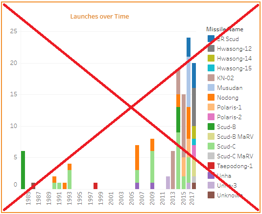
The NTI website provides several graphs of the data - one of them is a bar chart. It shows that the number of missile tests has increased in recent years, and colors the bar segments by the type of missile. But there are so many different types of missiles, that the color-coding isn't very useful. Also, there's not enough room to fit all the year labels on the bottom axis, which makes it a bit confusing (for example some spots with no bars have a year label, and some spots with a bar don't have a year label).
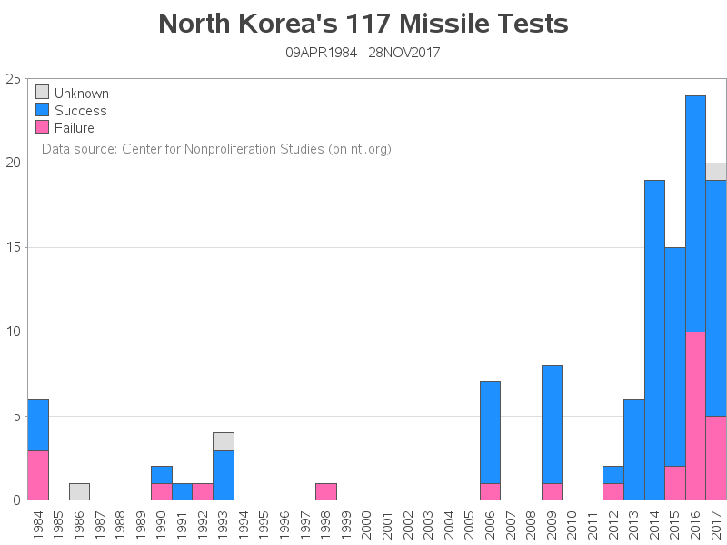
In my version I color the bar segments by the outcome (success/failure), and I show a year label for every bar. I also add a title showing the total number of missile tests, and the date range covered by the tests. I think my version is much easier to read, and get a good general sense of the data.
Map
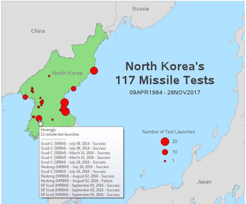
And now for the grand finale ... the map! In case you didn't know, maps is kinda my thing!
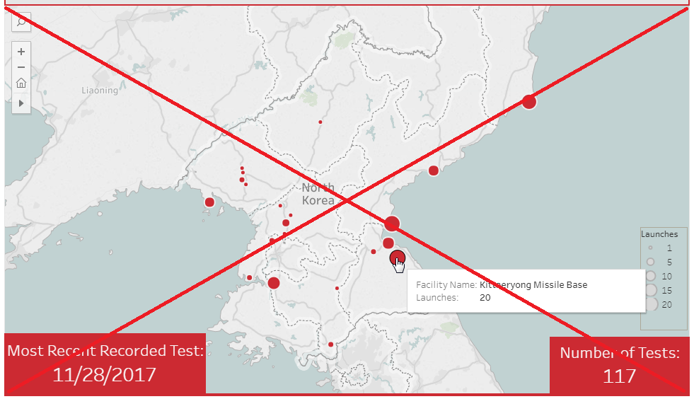
Their web page has a map, showing a red bubble at each launch location, with the size of the bubble representing the number of test launches from that location, and mouse-over text showing the total number of launches from each location. I approve of their approach in general (a simple map, showing the main information), but the technology they used to implement the map ruined the 'simplicity' factor for me.
It's an interactive map, and the interactivity became very frustrating. For example, you have to scroll down on the page to get to the map, and I use my mouse wheel to scroll down ... but when I get to the map, the scroll wheel starts automatically zooming-out the map (rather than scrolling down the page). I also found myself accidentally clicking on the map, which pans/moves it. And every time you accidentally zoom or pan the map, it has to re-draw (which takes several seconds). Here's a screen-capture of their map:
When I created my map, I made several improvements ... First, I used a static map, so you don't have to worry about accidentally panning or zooming it. My map also comes up much quicker in the browser, since it's only displaying a simple png image (rather than rendering map polygons). My mouse-over text not only shows the total number of launches, but also lists each individual launch. I use Proc Gremove to get rid of internal boundaries within countries (I only show the country border), and I color the countries such that North Korea stands out and all the other countries are visually less attention-grabbing (gray). And I make the water blue, so it's more obvious that it's water. Below is a screen-capture of my map - click it to see the interactive version with HTML mouse-over text.
Now that you've got a handle on all those North Korean missiles, what do you think the future holds? The last 4 years have had a large number of launches - will we see more launches, or fewer launches, in 2018?
All 117 North Korean missile tests! Share on X
6 Comments
Shared on LinkedIn, Robert. Succinct and informative.
Thanks Lonnie!
Where is the code?
Here's a link to the code! :)
http://robslink.com/SAS/democd96/north_korea_missiles_info.htm
NIce charts! For those interested, SAS Communities member @ChrisBrooks created a version of this map with PROC SGMAP, which is part of Base SAS and included in SAS University Edition. It's not as fancy as what you've shared, but his version required less code and can be rendered even if you don't have SAS/Graph.
Love this! I would like to add in potential arcs for each launch - i.e. flattening them out to show potential risk areas.