Have you ever played the lottery? Have you ever heard people bragging about all the money they've won? Does it make you want to play? ... We've had an Education Lottery here in North Carolina for over 10 years, but I still didn't really know much about it - therefore I picked that as my next topic to analyze. Follow along as I share some interesting things I found!
Bar Chart
The nclottery.com page has an Impact tab, with a couple of graphs, and a link to a table of county-level data. I first looked at their bar chart. Their web page was dynamic, so the bar chart grew in size as you made the page larger, but it never really got big enough to read the values along the axes and on the bars. They include a bars for 2006 and 2017, even though that was only a partial years. The 2017 bar makes it look like the lottery sales went down, but it's actually got several more months to go before the end of the fiscal year.
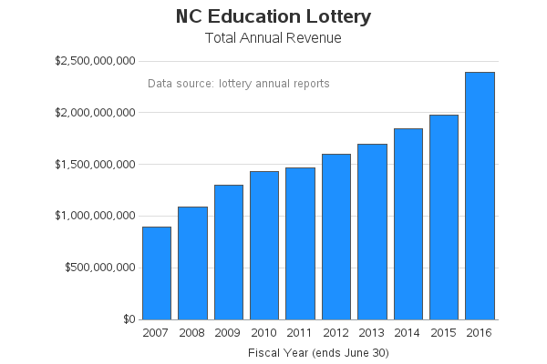
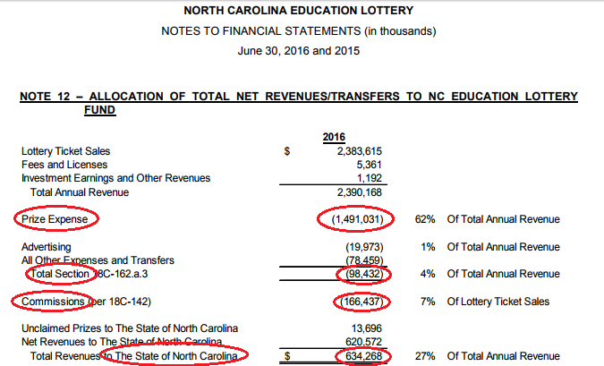
Of course, I decided to create my own version of this bar chart, and try to improve it ... I did some digging and found the data I needed in the lottery annual reports. Below is an example from the 2016 annual report (I had to visit each year's annual report, to pull out the one data point for each year).
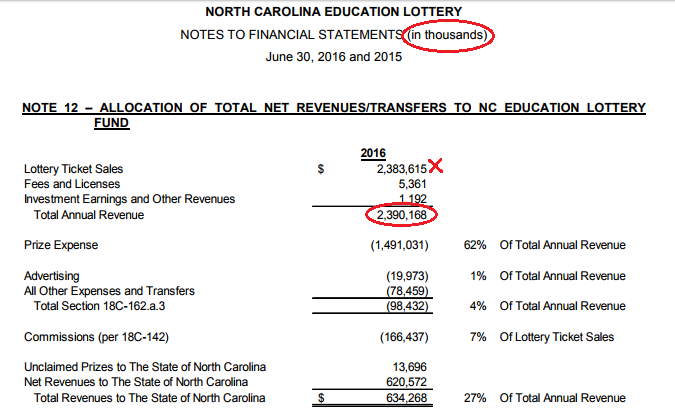
The annual reports had the lottery ticket sales numbers they had used in their bar chart, but they also had another number I liked even better - the total annual revenue (which also includes fees, licenses, earnings, etc). I decided to use this total in my chart. Here are some of the visual improvements I made:
- I left off 2006 and 2017, since they are partial years.
- Rather than using the values in thousands of dollars, I multiplied them out to show dollars - I think it's easier to understand $2,500,000,000 rather than $2,500,000 thousand.
- I mentioned that the fiscal year ends June 30, since many people might not know that.
- I made my text large enough to read.
- I listed the data source in a note.
Pie Chart
Next, they had a pie chart that showed how the money given to schools was used ... or does it(?) Schools get money from various sources, and they have various bills to pay. As long as all the bills get paid, who's to say that any particular dollar was used for one thing or another, eh? Therefore, in my opinion this chart is not really all that interesting ...
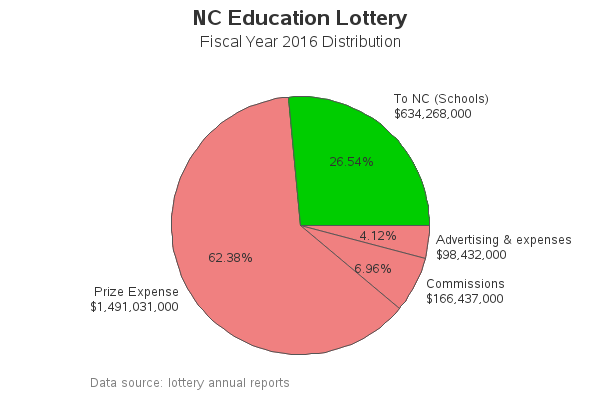
But I do want to know how much of the lottery money went to schools, versus how much went to other things. So I scraped those numbers out of the annual report (see circled in red below), and created a dataset I could plot.
I used a pie chart, even though some people 'preach' against them. They're actually a pretty good way of showing part-to-whole relationships in a way everyone can intuitively understand. What I wanted to know was, "Of all the lottery revenue, how big a 'piece of the pie' went to the schools?"
My pie chart shows that almost 27% of the lottery revenue went to the schools in 2016. Notice that I made the school slice bright green, and all the non-school slices another single, less eye-catching, color - this helps visually unclutter the pie, so people can easily see the part you want them to see. I also labeled the pie slices with both the percent, and the actual dollar amount.
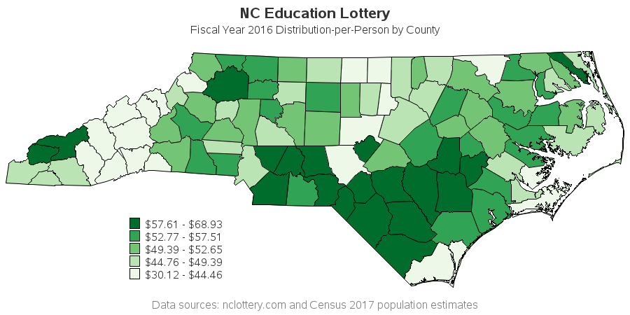
Geographical Map
The lottery impact page has a link to a table that shows the amount of lottery proceeds that has gone to each of the 100 counties in NC, for the current year, and also the total over all the years. It's nice to have the table, but it is difficult to comprehend and compare the values for all 100 counties. It's almost begging to be graphed, eh?
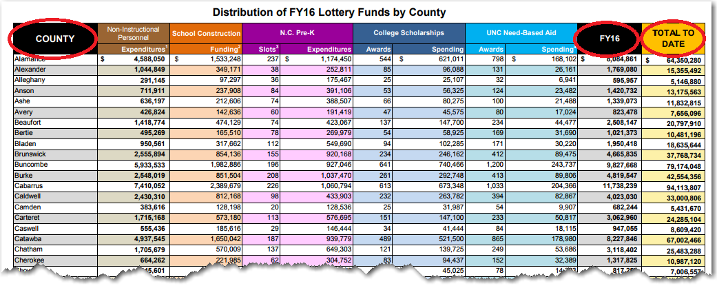
So I copy-n-pasted the data from the pdf table into a text file, cleaned it up just a bit in an editor (took out the '$' characters in the first data line, etc), and imported it into SAS. I was then able to plot the values on a map, showing how much of the 2016 lottery money went to schools in each county:
Wow! - The data's much easier to comprehend in a map than it was in a table, eh?!? Now you can easily see that ... um ... the counties with the largest populations, such as Wake and Mecklenburg (which contain Raleigh and Charlotte) get the most money. Hmm - well that's not very exciting, eh?
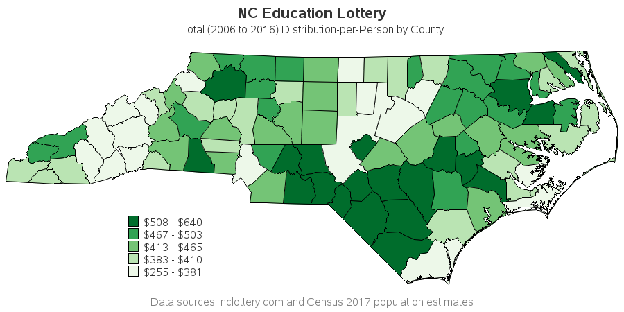
I decided it would be more interesting to see how much money-per-person went to each county. So I went to the Census website, and found a table of the latest NC population estimates by county. I copy-n-pasted the table into a text file, and imported it into SAS, so I could combine it with the lottery data and calculate the dollars-per-person. Here's the code I used:
proc sql noprint;
create table county_data_2016 as
select unique county_data_2016.*, county_population_2017.population
from county_data_2016 left join county_population_2017
on county_data_2016.county_name=county_population_2017.county_name;
quit; run;
data county_data_2016; set county_data_2016;
fy16_per_capita=fy16/population;
total_to_date_per_capita=total_to_date/population;
run;
Now I can map something other than just "more people = more money". Here is a map for 2016, followed by a map showing the total for all years. The per capita values make a much more fair comparison between counties. Notice that in these per capita maps, Wake and Mecklenburg counties are actually lighter colors (lower values) than most other counties.
Interesting Extras
Hopefully you've learned some interesting things about the lottery money, and also about the process of taking raw data and making meaningful/useful graphs. While I was researching the lottery and looking for data, I also found several very interesting news articles. I've decided to share a few interesting tidbits with you in this "Interesting Extras" section - enjoy!
In addition to the big lottery drawings where someone wins millions of dollars, there are many smaller games where people typically win a few dollars, a few hundred, or a few thousand dollars. They only track the ones where you win over $600. The Observer obtained the data for 189,000 winning claims (it's considered "public information") and analyzed them, paying special attention to repeat winners. They determined that some players were winning so consistently that the chances of that happening by luck alone were less than one in a trillion. Ralph Havis has won 55 times, and Virginia Tech statistician George Rooney says the chances of that happening are "less than 1 in 1 trillion, trillion, trillion".
The frequent winners who were interviewed by The Observer claim that they buy a lot of tickets, and/or they are lucky. The executive director of the lottery, Alice Garland, says "I've just decided there are lucky people in the world."
However ... an alternate theory is that these people are buying winning tickets from others (a practice called discounting). But who would sell a winning lottery ticket? Especially, for less than the winning value? ... Well, that would probably be people who owe back-taxes and/or child support, because that money would otherwise be taken out of their lottery winnings. If you have a winning $1000 lottery ticket, would you rather have the government use most/all of that to pay off what you owe, or would you rather sell that lottery ticket to someone else for a portion of the winnings ($500, $300, maybe even $100)?
The practice of discounting is against the law in some states (such as Florida), but not illegal in NC. However, according to The Observer article, it is "against lottery policy for store owners or employees to buy or sell discounted winning tickets." It seems odd then, that many lottery retailers and employees are such frequent winners. For example, retailer Amitkumar Pandya has won more big lottery prizes than any of his customers (42 of 99), according to another Observer article ... presumably without buying discounted winning tickets, since that's against the rules. Alice Garland says that "multiple wins could come from retailers or clerks who simply play a lot" (hmm ... that sounds a bit 'optimistic' to me).
Here's another example from the article. Hitesh and Tejal Patel have 22 lottery wins (including a $1 million prize), mostly from tickets bought at their own store. Hitesh claims he typically spends $2 to $5 each day on the lottery. His strategy? - Every morning he lights a candle and incense, and prays to the Hindu god Krishna. Hmm ... perhaps I need to change religions!?!
If these frequent winners (in particular store owners and employees) are buying discounted winning tickets, why would the lottery officials "turn a blind eye"? Why don't the NC politicians make the practice illegal?Perhaps without discounting, people who owe back taxes and/or child support would tend to not play the lottery ... thereby reducing the amount of money brought in by the lottery. I guess ticket discounting doesn't take any money out of the lottery officials' and politicians' pockets, so they let it continue. It only hurts the honest taxpayers, who foot the bill for the things the unpaid taxes and unpaid child support could have otherwise been used to pay for.
Seems like there might be room for some improvements ... and hopefully analytics can be a part of identifying the problems, and verifying the fixes!


11 Comments
When billions are involved I like to see the dollars in millions. Check the presentations at the VA.
https://www.va.gov/finance/docs/afr/2017VAafrFullWeb.pdf
Great analytical graphical maps Robert! But, I especially appreciated the EXTRAS! That data could lead to big improvements if used wisely!
Thanks! - the 'Extras' info was just too interesting not to include (even though I didn't find a way to graph it). Glad you liked it!
Love the maps, thanks!
Thanks Craige! - That especially means a lot coming from you! :)
"I think it's easier to understand $2,500,000,000 rather than $2,500,000 thousand."
I agree. But "$2.5 billion" is even easier, at least in the "total revenue" chart where all of the numbers were around that order of magnitude, and where you're not printing exact values anyway. The pie and maps indeed need dollars.
I tend to agree with you on the "$2.5 billion" ... but then again, I kinda like the impact that seeing all those zeros has on people too! ;)
Rather than seeing the amount of money per person, it would be interesting to see the amount of money per school-age child. I suspect there's data somewhere about how many children are in school in each county. That would better adjust for counties with higher or lower percentages of the population in school.
For example, in Orange County (where I live) a significant percentage of the people are college students at UNC, and are unlikely to have any children yet. That may explain why Orange County in your map gets less money per person than some other counties.
Hmm ... possibly. Does the census count where students live, or where their "permanent address" is? (which is often at their parents' house), or where they're registered to vote, or where they pay taxes? I don't know the answers to a lot of those questions, so I just stuck with the total census population per county. :)
The problem with census population is you are including people in the count who would not get the money otherwise. Only schools get the money. Some counties have higher populations of people over 50 (rural, western?) than others (urban?). It does help to account for the fact that the larger counties like Wake and Mecklenburg have more money and therefore need less of the lottery money. Interesting graphs. Thanks!
Hmm ... perhaps this is one of those situations where it would be good to map the data in several different ways! :)