Have you, or someone you know, gotten the flu this year? Word on the street is that this year's flu might be particularly bad, and the data seem to be corroborating that so far. You don't want to take my word for it? -- well then, let's have a look at the data!
First, here's some "small data" on the topic - 2 data points, to be exact. This is a picture of my co-worker Jennifer, and her husband Rick. They both got the flu this year (and Rick actually ended up in the hospital). Hope you guys have a full & speedy recovery!

Now, let's move on to some "bigger data"!
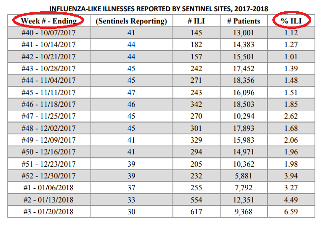
I did a bit of Google searching, and found some data for the prevalence of flu in my state (North Carolina), for the 2017-2018 winter flu season. Here's a screen-capture of the table:
They also had a graph of this data, overlaid with the previous two years (2016-2017, and 2015-2016), for easy comparison.
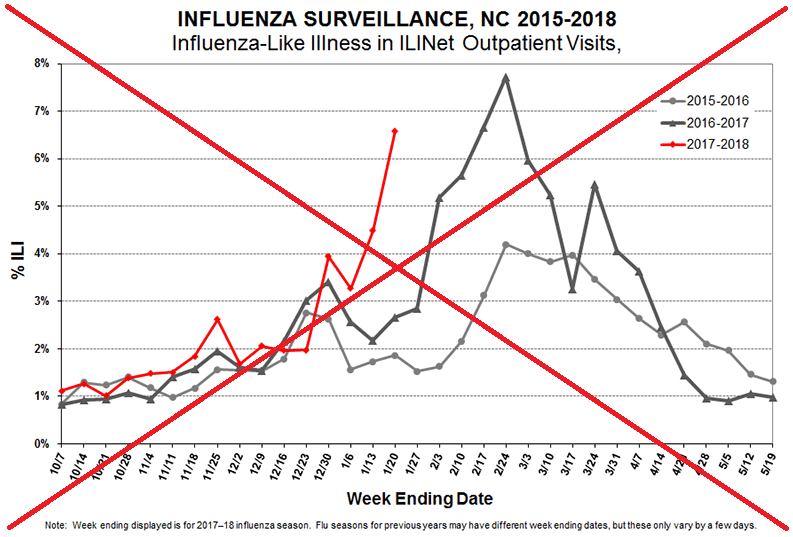
The biggest technical problem with the graph was the date axis (along the bottom). The data points are collected weekly, but the same weeks don't have the same ending dates each year. They plotted the data to the most recent year's dates, and then added a footnote trying to explain that the dates don't necessarily line up. I think this will just confuse people, and the need for an explanatory footnote makes the graph more visually cluttered. And do all those dates along the bottom axis add anything to my understanding of the graph?
It was also a bit difficult to distinguish the lines, and match them up to the legend. The markers are a different shape in each line, but they're too small to easily see. Also, the colors for the previous two years are too similar (black, and dark gray).
Also, you can't tell what the exact data values or dates are. There's no mouse-over text, etc, to show the values.
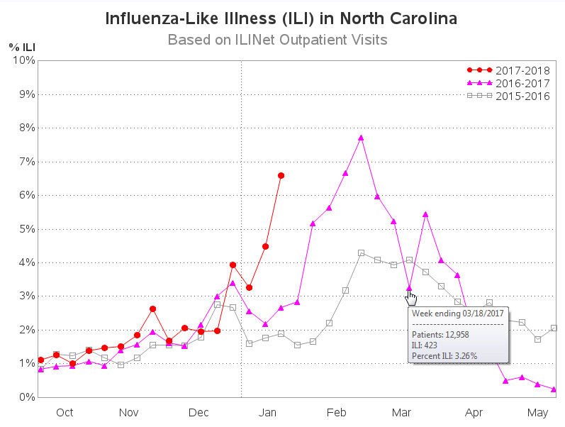
In my new/improved version of the graph, I try to fix those problems, and also make a few other small improvements. Below is a screen-capture of my graph (click it to see the interactive version, with mouse-over text). If you'd like to see the exact SAS code I used to work my magic in this graph, here is a link to the code.
What do you think of my changes? Do you have any other suggestions?
Hopefully with better graphs, we can better prepare against this year's flu!
If you're interested in seeing even more flu data, click here to see my US map animation!


5 Comments
Percent ILI depends on whatever else is going around at the time. In a bad season for bronchitis or whooping cough, is this still the correct measurement?
That being said, Robert's graph is much cleaner and easier to digest than the original.
Given that the data is definitely seasonal a circular radar chart would also work for this data. Would be an interesting graphic for sure.
Hmm - might be interesting to try!
% ILI seems like a weird metric to use. (Weird's not quite the right word.) % ILI is dependent upon the number of total patients the clinics (or whatever the "sentinel sites" are) see. Are those denominators comparable year-to-year? I'd like to compare a graph using the raw cases with the one using the % to see if the shape/trend holds.
I agree with Elizabeth. Percent ILI depends on whatever else is going around at the time. In a bad season for bronchitis or whooping cough, is this still the correct measurement?
That being said, Robert's graph is much cleaner and easier to digest than the original.