Analyzing ticket sales and customer data for large sports and entertainment events is a complex endeavor. But SAS Visual Analytics makes it easy, with location analytics, customer segmentation, predictive artificial intelligence (AI) capabilities – and more.
This blog post covers a brief overview of these features by using a fictitious event company called InsightEvents. In this demonstration scenario, the company looks after marketing and ticket sales for a number of stadiums in the Los Angeles area. As a business analyst, I’m looking into our current subscriber data base since we noted a decrease in ticket sales compared to last year.
I demonstrated these features at this year’s SAS Global Forum technology session, including a number of exciting features around location analytics.
Customer distribution
The first page of the report shows information about members, their geographical location as well as details about tickets sold across different ticket categories.
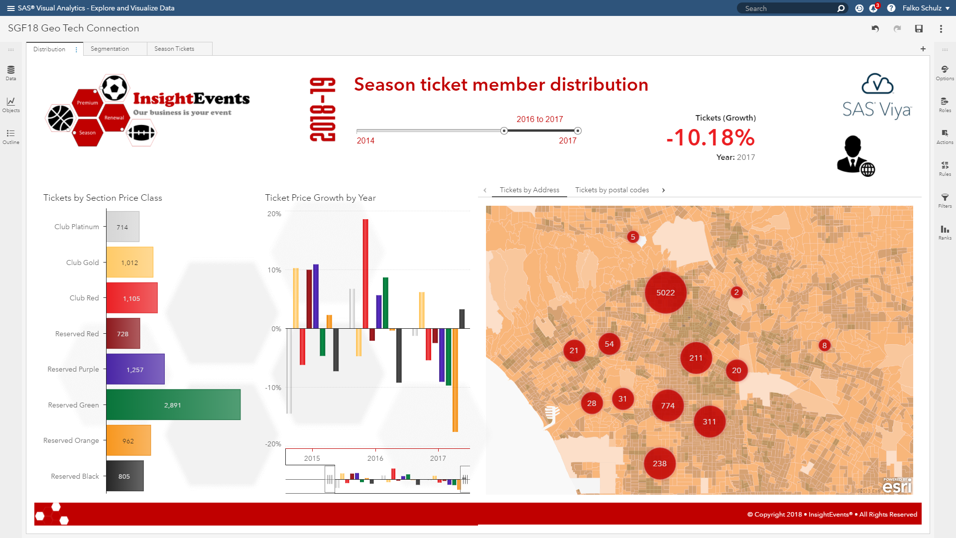
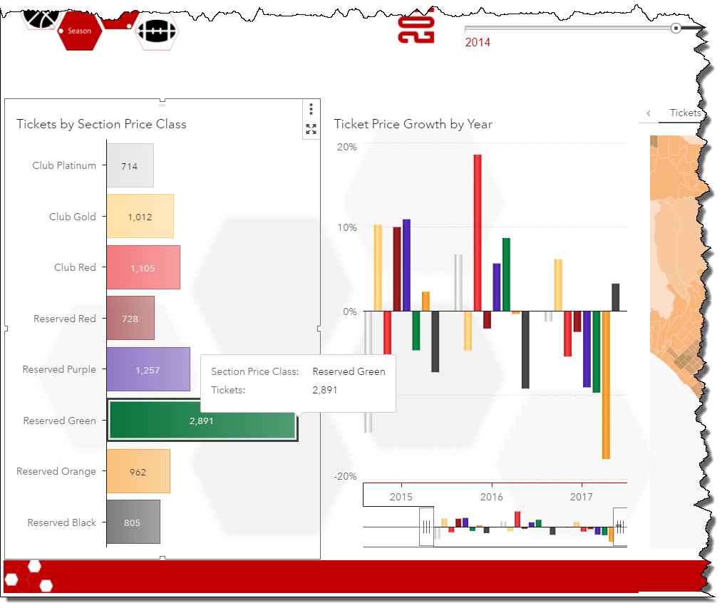
The left-hand graph above shows that our most popular class is "reserved green" given its attractive entry price. Higher class tickets such as "club gold" or "club red" are sold less often, as expected.
Looking into the second graph, which visualizes the ticket growth by year for each of the given ticket classes, we notice that some classes have significantly declined in ticket sales. In particular, the "reserved orange" as well as our high sale "reserved green" class declined compared to last year.
Let’s look into the geographical distribution of our customers.
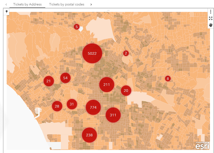
This map above shows a clustered view of our current member database. SAS Viya uses built-in clustering algorithms to determine cluster nodes given the geographical location of the underlying address data. Users have options to adjust clustering given their preference such as maximum number of clusters or the desired spacing. Clustering will re-run automatically as you navigate in the map.
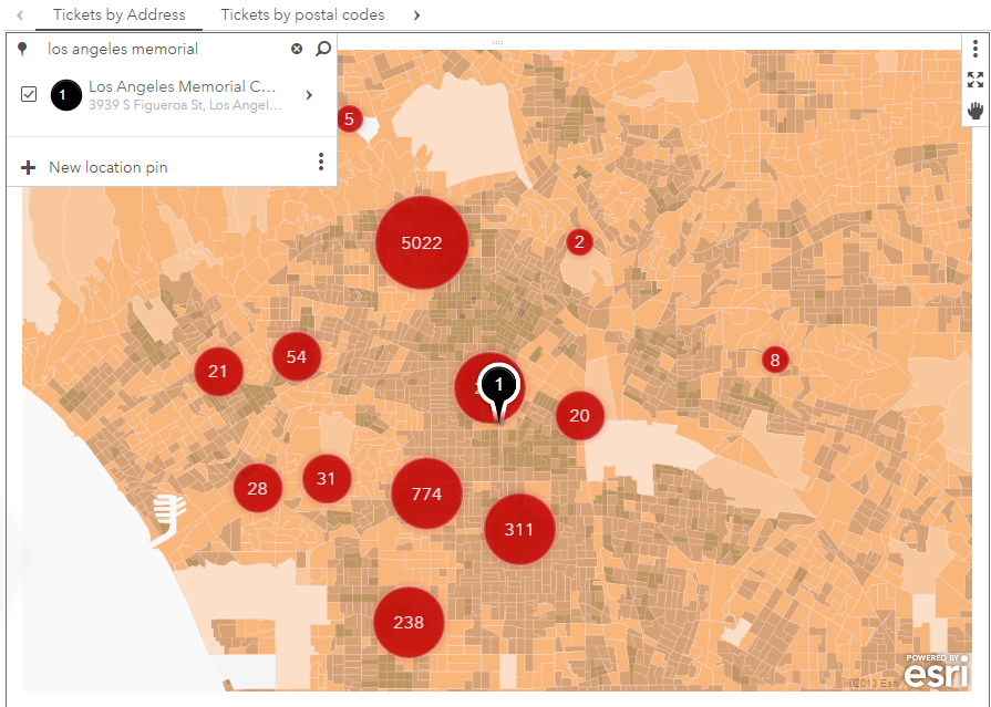
For this analysis and to further understand our customer distribution and demographics, I'm going to start off with finding the event location. The built-in search facility helps to quickly add markers of favorite locations. As I’m entering Los Angeles memorial as the location, suggestions will be shown with matching locations in our current view port. Selecting one of the suggestions will add the related point-of-interest to the map.
So it appears most of our customers are close to the stadium with a larger population in the north. Let’s see whether we can use some advanced analytics to further gain some insights in our customer segments.
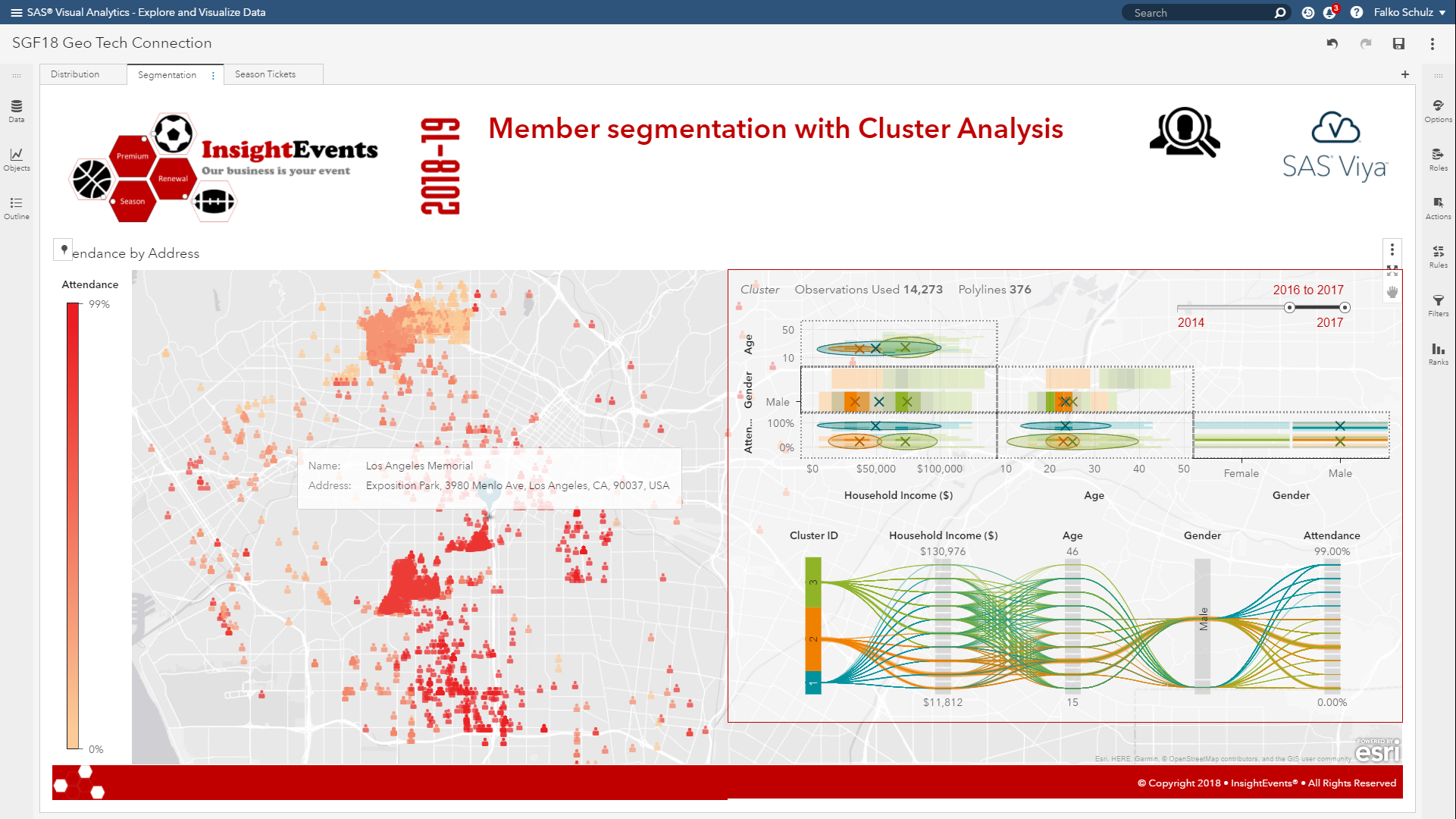
Customer segmentation
The clustering we are seeing takes into account the geographical location only. Let’s apply some AI to get a better understanding of what differentiates our ticket holders. This page shows our current subscriber data base including a geographical distribution as well as a cluster analysis on the right-hand side. The map shows our members and their average event attendance throughout the year.
Now, given we have the exact event location – we can calculate the distance from the stadium in order to see how many customers live in close proximity. Travel analysis can be executed either on the location pin or using the top-left search menu. You have options to either calculate the actual distance given the type of travel such as driving or walking – or perform the analysis given the time it takes to travel.
For this demonstration, I’m going to create a travel-time analysis. Given the day of the week or time of the day – traveling to and from the stadium may take significantly longer. SAS Visual Analytics can also include typical historic travel times as well as live traffic. So let’s find out which customers can make it to the stadium in 10 or 20 minutes on a typical Saturday evening. SAS Visual Analytics supports different options including the unit and travel mode. Assuming most people will drive or take public transport – we keep the defaults here. Executing this location analysis – shows the expected polygon around the stadium.
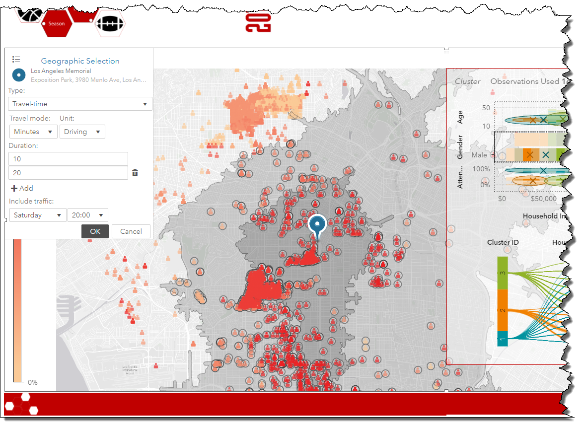
Not surprisingly, as members are located further away they typically attend less events – not only being at risk not renewing next year’s season ticket subscription but also having a negative effect on event days with less onsite sales such as food or merchandise.
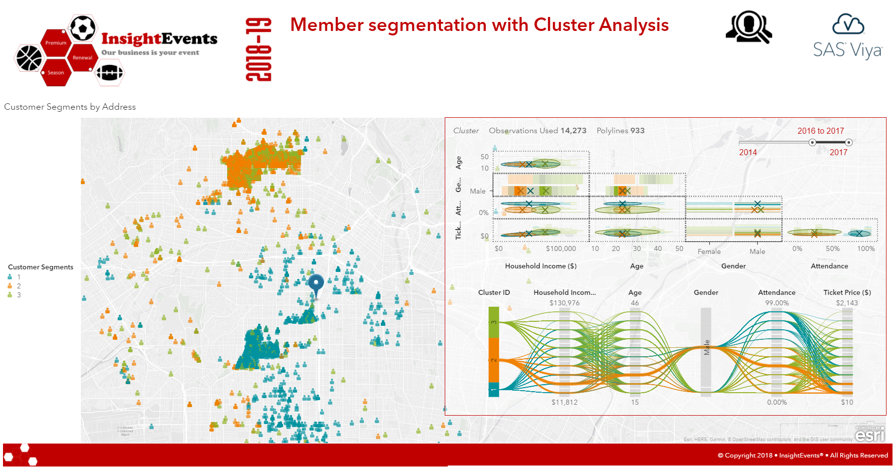
Now, let’s see whether we can use SAS Viya to perform a cluster analysis on our customer data base. The existing cluster analysis on the right-hand side show three clusters given the pre-defined variables such as household-income, age or gender.
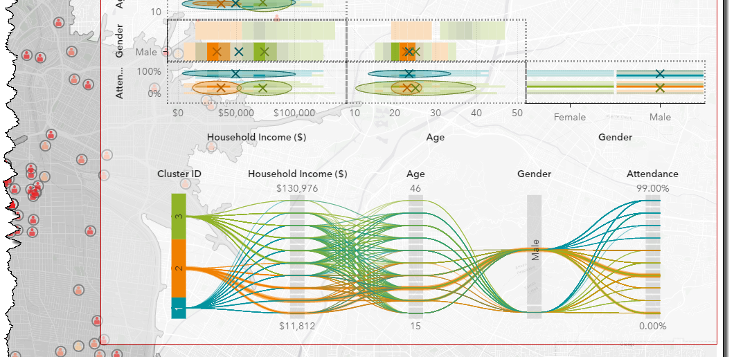
Given that ticket price may also be an important variable to segment our customers, I’m going to add this variable to the analysis by dragging this data item from the data panel. SAS Viya re-calculates the customer segment given the new set of variables.
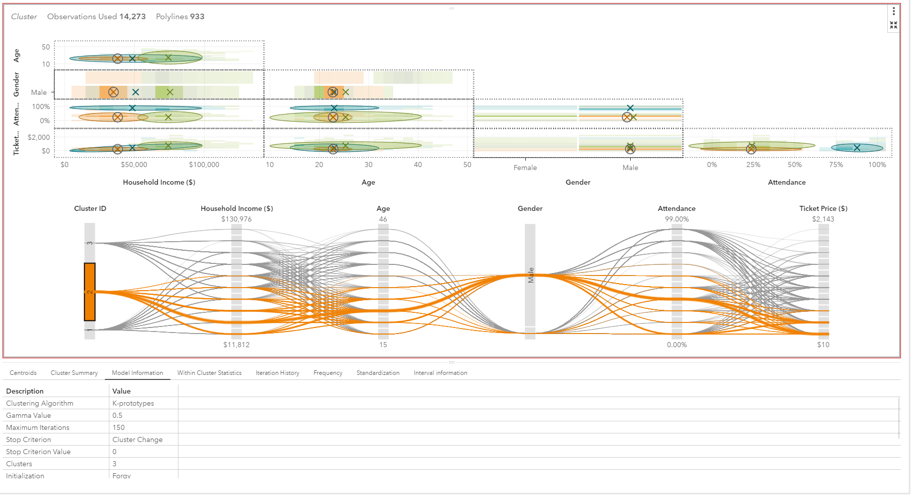
Cluster 2 looks very interesting as it represents a larger number of ticket holders, mostly young men with low-household income and surprisingly low attendance as well as low ticket class purchases. So this customer segment may be a good candidate for marketing to potential up-sell given attractive new season ticket offers to both increase event attendance as well as sell of higher class tickets.
So let’s look into cluster “2” further and see what potential marketing offers we can apply given their geographical distribution.
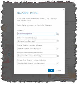
In order for us to utilize cluster information in other visualizations – we need to first derive the cluster ID – so creating a new data item – containing a value between 1 and 3. Deriving a cluster id is simply done by selecting the corresponding menu item.
This new item is now listed in the data panel and available to be assigned to other visualization.
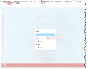
So let’s drag this item on the geo map and group by the cluster instead of the existing event attendance.
The new map now shows each individual customer and assigned cluster ID. Additional filters could now be applied to filter for specific customer segments only.
Interestingly, members of cluster 2 live relatively far away from the stadium which can explain their low attendance. They are also geographically grouped in the far north-west. So let’s find out – how far away these customers actually are by performing a route distance calculation to the stadium.
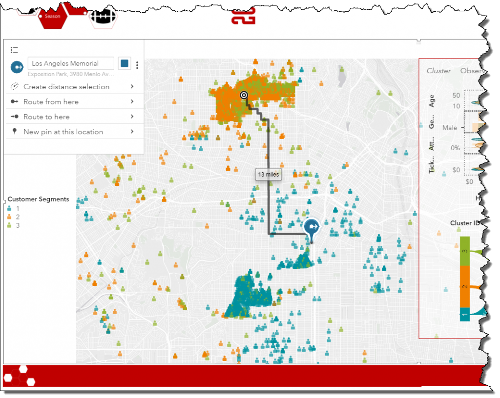
It seems customers in this geographical group have to travel more than 10 miles to reach the stadium which given previous travel-analysis takes longer than any other customer segment, likely related to poor public transport connections or traffic density.
Seating reports
Given we now know where ticket holders live – let’s find out where they sit in the stadium and investigate additional details about season ticket class structure and seating before handing over to marketing. This report page shows some additional details about our stadium including distribution of ticket classes across stadium sections.
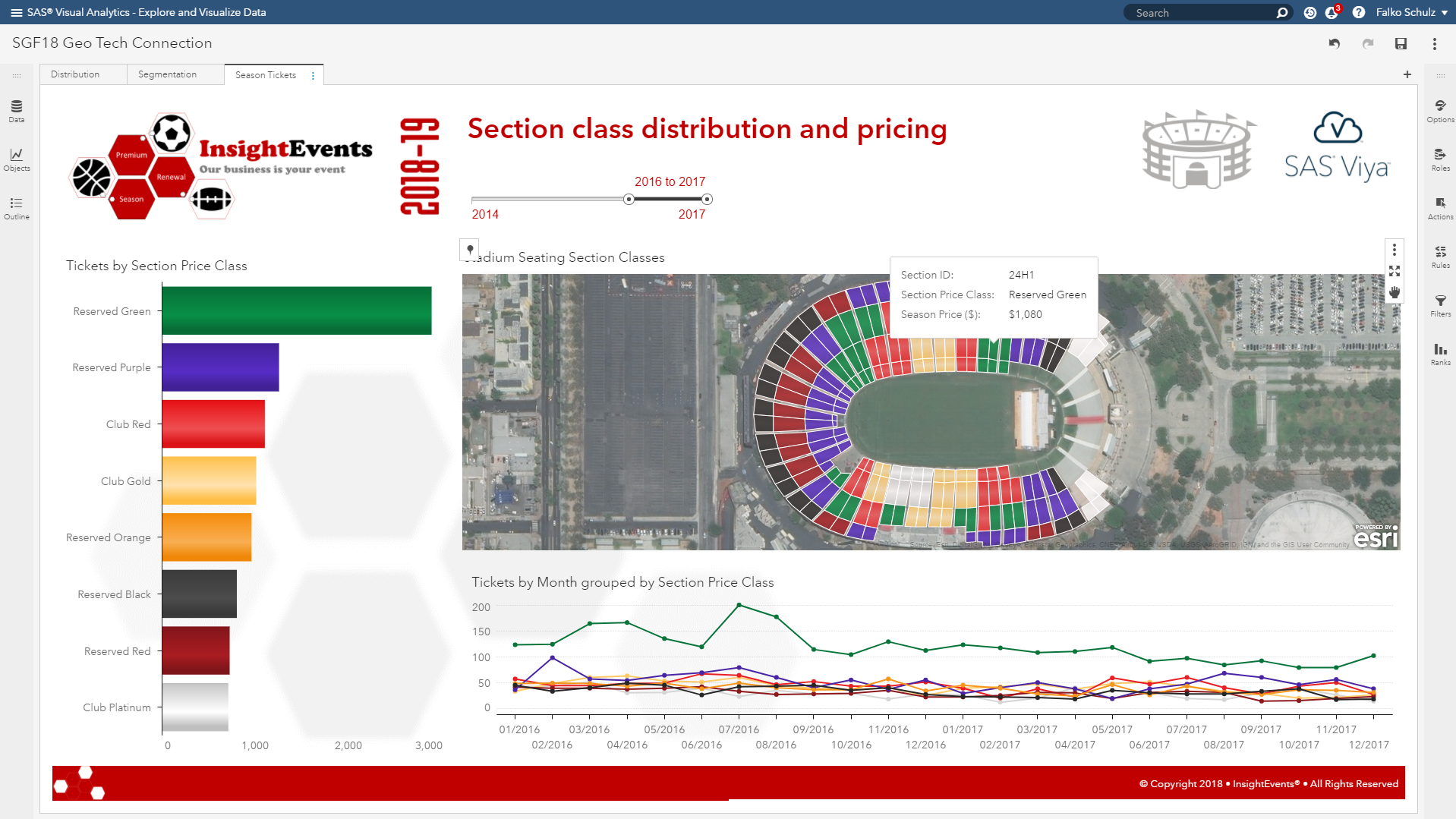
SAS Visual Analytics supports special polygon rendering for things like floor plans, seating maps, etc. which has been used here to visualize the stadium sections. A satellite imagery has been used for the geo map background. More detailed polygons may be imported to show details on seat-level if required.
The left-hand graph shows the tickets sold by class – again showing our most popular ‘reserved green’ class on top. The bottom right line chart shows the tickets sold over time for each category.
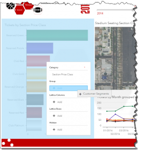
Now, let’s bring in our recently created customer segments by dragging this item on the bar chart in order to group ticket sales by customer segment.
Selecting our cluster “2” updates the charts to show data for this segment only and we can see where people sit.
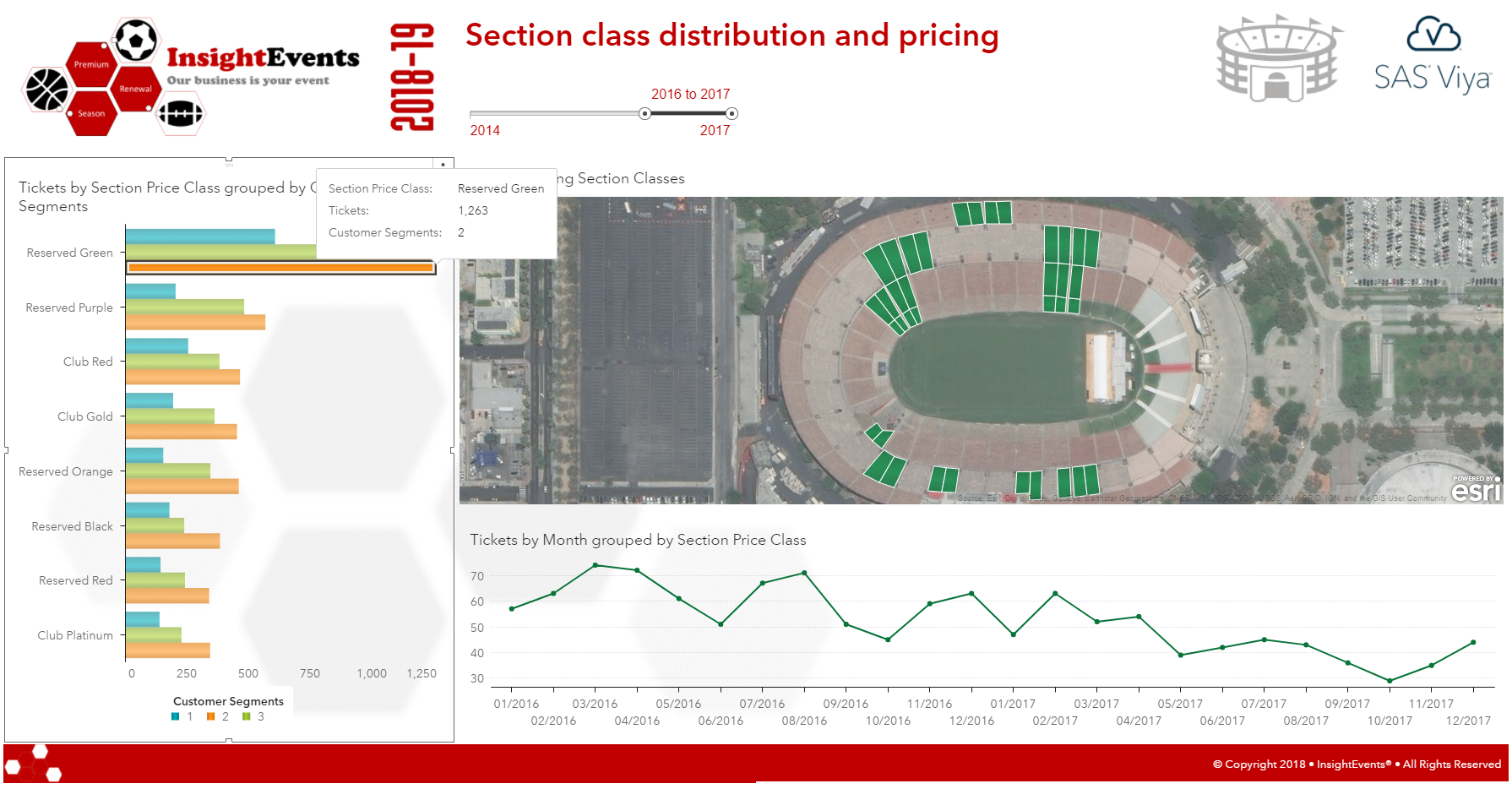
Selecting a particular class – shows data for this class only. While there was a slight increase in ticket sales in December for our popular "reserved green" class – overall ticket sales have been decreased since start of last year – further supporting to target this ticket class and customer segment for marketing.
Conclusion
It’s now all coming together – with customers in cluster 2 predominantly holding the most popular ticket class, "Reserved Green." We learned where they live and where they sit in the stadium and can use the related customer segments to target specific marketing campaigns, e.g. to offer public transport or seat upgrades.
SAS Visual Analytics not only provides a robust platform for designing infographics or dashboards but also enables organizations to include advanced analytics in their decision making process.

6 Comments
Definitely share-worthy. One of my favorite posts this year, Falko.
This is a great article. Very well done. I just wish you would share the dataset.
Hi James, there is a compressed version of the SAS data set at my github site. Note, that this is a manufactured data set for the purpose of this blog and related demonstrations - so customer locations and related addresses are random. Thanks, Falko
This was some nice data storytelling.
For the A satellite imagery has been used for the geo map background... Is this a static image that you imported into SAS Viya or is this a service you are accessing externally?
Hi Kathleen, the satellite imagery is an external map service provided by Esri ArcGIS Online. SAS Visual Analytics provide free access to a number of Esri map services including street, terrain or satellite. A user can simply toggle between different services in the options panel when building the report.
Hope this helps. Falko