The ROC curve is a graphical method that summarizes how well a binary classifier can discriminate between two populations, often called the "negative" population (individuals who do not have a disease or characteristic) and the "positive" population (individuals who do have it). As shown in a previous article, there is
Tag: Statistical Graphics
The purpose of this article is to show how to use SAS to create a graph that illustrates a basic idea in a binary classification analysis, such as discriminant analysis and logistic regression. The graph, shown at right, shows two populations. Subjects in the "negative" population do not have some
A SAS programmer wanted to create a graph that illustrates how Deming regression differs from ordinary least squares regression. The main idea is shown in the panel of graphs below. The first graph shows the geometry of least squares regression when we regress Y onto X. ("Regress Y onto X"
In my book Simulating Data with SAS, I show how to use a graphical tool, called the moment-ratio diagram, to characterize and compare continuous probability distributions based on their skewness and kurtosis (Wicklin, 2013, Chapter 16). The idea behind the moment-ratio diagram is that skewness and kurtosis are essential for
Did you add "learn something new" to your list of New Year's resolutions? Last week, I wrote about the most popular articles from The DO Loop in 2019. The most popular articles are about elementary topics in SAS programming or univariate statistics because those topics have broad appeal. Advanced topics
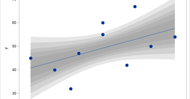
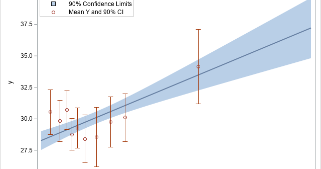
Many SAS procedures can automatically create a graph that overlays multiple prediction curves and their prediction limits. This graph (sometimes called a "fit plot" or a "sliced fit plot") is useful when you want to visualize a model in which a continuous response variable depends on one continuous explanatory variable
Last year, I wrote more than 100 posts for The DO Loop blog. The most popular articles were about SAS programming tips for data analysis, statistical analysis, and data visualization. Here are the most popular articles from 2019 in each category. SAS programming tips Create training, testing, and validation data
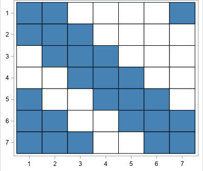
A 2-D "bin plot" counts the number of observations in each cell in a regular 2-D grid. The 2-D bin plot is essentially a 2-D version of a histogram: it provides an estimate for the density of a 2-D distribution. As I discuss in the article, "The essential guide to
Recently I showed how to visualize and analyze longitudinal data in which subjects are measured at multiple time points. A very common situation is that the data are collected at two time points. For example, in medicine it is very common to measure some quantity (blood pressure, cholesterol, white-blood cell
This is a second article about analyzing longitudinal data, which features measurements that are repeatedly taken on subjects at several points in time. The previous article discusses a response-profile analysis, which uses an ANOVA method to determine differences between the means of an experimental group and a placebo group. The