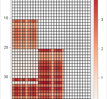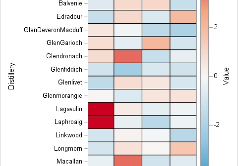
Order matters. The order of variables in tables and rows of a correlation matrix can make a big difference in how easy it is to observed correlations between variables or groups of variables. There are many ways to order the variables, but this article shows how to display the variables
Tag: Statistical Graphics
In SAS, range attribute maps enable you to specify the range of values that determine the colors used for graphical elements. There are various examples that use the GTL to define a range attribute map, but fewer examples that show how to use a range attribute map with PROC SGPLOT.
Modern software for statistical graphics automatically handles many details and graph defaults, such as the range of the axes and the placement of tick marks. In the days of yore, these details required tedious manual calculations. Think about what is required to place ticks on a scatter plot. On the
This article demonstrates how to use PROC GENMOD to perform a Poisson regression in SAS. There are different examples in the SAS documentation and in conference papers, but I chose this example because it uses two categorical explanatory variables. Therefore, the Poisson regression can be visualized by using a contingency
A SAS programmer wanted to visualize density estimate for some univariate data. The data had several groups, so he wanted to create a panel of density estimate, which you can easily do by using PROC SGPANEL in SAS. However, the programmer's boss wanted to see filled density estimates, such as
Years ago, I wrote an article that showed how to visualize patterns of missing data. During a recent data visualization talk, I discussed the program, which used a small number of SAS IML statements. An audience member asked whether it is possible to construct the same visualization by using only
A dot plot is a standard statistical graphic that displays a statistic (often a mean) and the uncertainty of the statistic for one or more groups. Statisticians and data scientists use it in the analysis of group data. In late 2023, I started noticing headlines about "dot plots" in the
Recently, I saw a scatter plot that displayed the ticks, values, and labels for a vertical axis on the right side of a graph. In the SGPLOT procedure in SAS, you can use the Y2AXIS option to move an axis on the right side of a graph. Similarly, you can
Happy Pi Day! Every year on March 14th (written 3/14 in the US), people in the mathematical sciences celebrate all things pi-related because 3.14 is the three-decimal approximation to π ≈ 3.14159265358979.... Pi is a mathematical constant defined as the ratio of a circle's circumference (C) to its diameter (D).
I sometimes see analysts overuse colors in statistical graphics. My rule of thumb is that you do not need to use color to represent a variable that is already represented in a graph. For example, it is redundant to use a continuous color ramp to represent the lengths of bars