Happy Pi Day! Every year on March 14th (written 3/14 in the US), people in the mathematical sciences celebrate all things pi-related because 3.14 is the three-decimal approximation to π ≈ 3.14159265358979.... Pi is a mathematical constant defined as the ratio of a circle's circumference (C) to its diameter (D).
Tag: Statistical Graphics
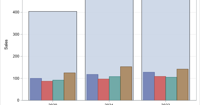
I sometimes see analysts overuse colors in statistical graphics. My rule of thumb is that you do not need to use color to represent a variable that is already represented in a graph. For example, it is redundant to use a continuous color ramp to represent the lengths of bars
In a previous article, I presented some of the most popular blog posts from 2023. The popular articles tend to discuss elementary topics that have broad appeal. However, I also wrote many technical articles about advanced topics. The following articles didn't make the Top 10 list, but they deserve a
In 2023, I wrote 90 articles for The DO Loop blog. My most popular articles were about SAS programming, data visualization, and statistics. In addition, several "general interest" articles were popular, including my article for Pi Day and an article about AI chatbots. If you missed any of these articles,
These are a few of my favorite things. —Maria in The Sound of Music For my annual Christmas-themed post, I decided to forgo fractal Christmas trees and animated greeting cards and instead present a compilation of some of my favorite data visualization tips for advanced SAS users. Hopefully, this
Plot rates, not counts. This maxim is often stated by data visualization experts, but often ignored by practitioners. You might also hear the related phrases "plot proportions" or "plot percentages," which mean the same thing but expresses the idea alliteratively. An example in a previous article about avoiding alphabetical ordering
Howard Wainer, who used to write the "Visual Revelations" column in Chance magazine, often reminded his readers that "we are almost never interested in seeing Alabama first" (2005, Graphic Discovery, p. 72). His comment is a reminder that when we plot data for a large number of categories (states, countries,
Sometimes it is helpful to display a table of statistics directly on a graph. A simple example is displaying the number of observations and the mean or median on a histogram. In SAS, the term inset is used to describe a table that is displayed on a graph. This article
Did you know that you can embed one graph inside another by using PROC SGPLOT in SAS? A typical example is shown to the right. The large graph shows kernel density estimates for the distribution of the Cholesterol variable among male and female patients in a heart study. The small
I don't often use the SG annotation facility in SAS for adding annotations to statistical graphics, but when I do, I enjoy the convenience of the SG annotation macros. I can never remember the details of the SG annotation commands, but I know that the SG annotation macros will create