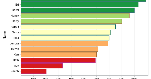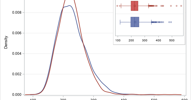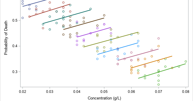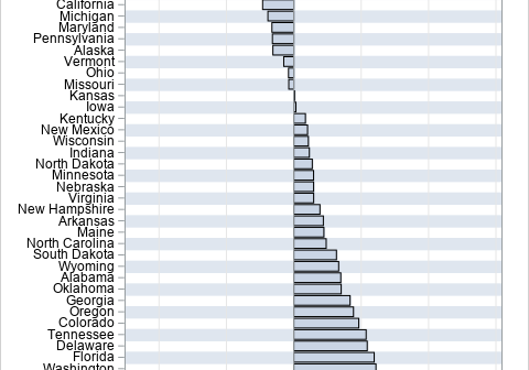
A profile plot is a way to display multivariate values for many subjects. The optimal linear profile plot was introduced by John Hartigan in his book Clustering Algorithms (1975). In Michael Friendly's book (SAS System for Statistical Graphics, 1991), Friendly shows how to construct an optimal linear profile by using
Tag: Statistical Graphics
A profile plot is a compact way to visualize many variables for a set of subjects. It enables you to investigate which subjects are similar to or different from other subjects. Visually, a profile plot can take many forms. This article shows several profile plots: a line plot of the
A SAS programmer asked how to create a graph that shows whether missing values in one variable are associated with certain values of another variable. For example, a patient who is supposed to monitor his blood glucose daily might have more missing measurements near holidays and in the summer months
I recently showed how to represent positive integers in any base and gave examples of base 2 (binary), base 8 (octal), and base 16 (hexadecimal). One fun application is that you can use base 26 to associate a positive integer to every string of English characters. This article shows how
A SAS programmer was trying to understand how PROC SGPLOT orders categories and segments in a stacked bar chart. As with all problems, it is often useful to start with a simpler version of the problem. After you understand the simpler situation, you can apply that understanding to the more
A SAS programmer asked how to display long labels at irregular locations along the horizontal axis of scatter plot. The labels indicate various phases of a clinical study. This article discusses the problem and shows how to use the FITPOLICY=STAGGER option on the XAXIS or X2AXIS statement to avoid collisions
For a linear regression model, a useful but underutilized diagnostic tool is the partial regression leverage plot. Also called the partial regression plot, this plot visualizes the parameter estimates table for the regression. For each effect in the model, you can visualize the following statistics: The estimate for each regression
The ODS GRAPHICS statement in SAS supports more than 30 options that enable you to configure the attributes of graphs that you create in SAS. Did you know that you can display the current set of graphical options? Furthermore, did you know that you can temporarily set certain options and
Recently, I showed how to use a heat map to visualize measurements over time for a set of patients in a longitudinal study. The visualization is sometimes called a lasagna plot because it presents an alternative to the usual spaghetti plot. A reader asked whether a similar visualization can be
Oh, no! Your boss just told you to change the way that SAS displays certain features in graphs, such as missing values. But you have a library of hundreds of SAS programs! Do you need to modify all of your previous programs? Fortunately, the answer is no. SAS provides ODS