I was recently asked how to create a frequency polygon in SAS. A frequency polygon is an alternative to a histogram that shows similar information about the distribution of univariate data. It is the piecewise linear curve formed by connecting the midpoints of the tops of the bins. The graph
Tag: Statistical Graphics
A SAS programmer asked whether it is possible to add reference lines to the categorical axis of a bar chart. The answer is yes. You can use the VBAR statement, but I prefer to use the VBARBASIC (or VBARPARM) statement, which enables you to overlay a wide variety of graphs
Graphing data is almost always more informative than displaying a table of summary statistics. In a recent article about "dynamite plots," I briefly mentioned that graphs such as box plots and strip plots are better at showing data than graphs that merely show the mean and standard deviation. This article
A statistical programmer asked how to simulate event-trials data for groups. The subjects in each group have a different probability of experiencing the event. This article describes one way to simulate this scenario. The simulation is similar to simulating from a mixture distribution. This article also shows three different ways
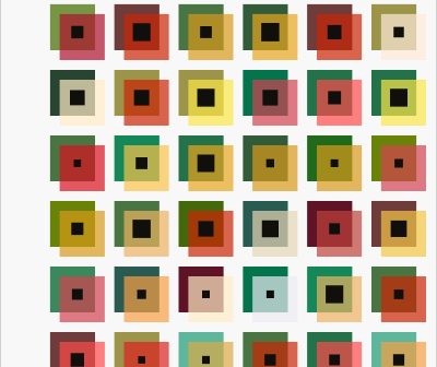
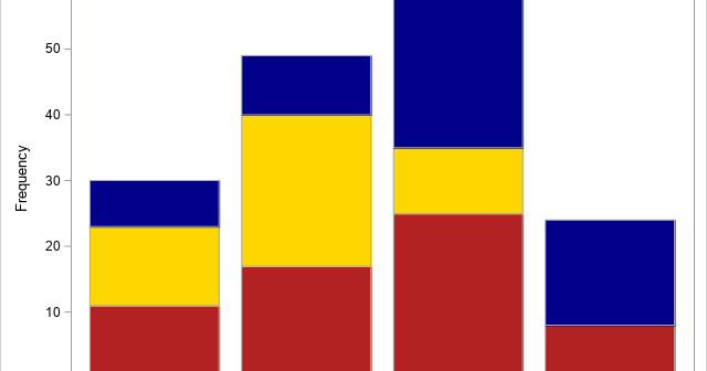
A colleague spent a lot of time creating a panel of graphs to summarize some data. She did not use SAS software to create the graph, but I used SAS to create a simplified version of her graph, which is shown to the right. (The colors are from her graph.)
This article shows how to create a "sliced survival plot" for proportional-hazards models that are created by using PROC PHREG in SAS. Graphing the result of a statistical regression model is a valuable way to communicate the predictions of the model. Many SAS procedures use ODS graphics to produce graphs
In a previous article, I discussed a beautiful painting called "Phantom’s Shadow, 2018" by the Nigerian-born artist, Odili Donald Odita. I noted that if you overlay a 4 x 4 grid on the painting, then each cell contains a four-bladed pinwheel shape. The cells display rotations and reflections of the pinwheel. The
This article shows how to estimate and visualize a two-dimensional cumulative distribution function (CDF) in SAS. SAS has built-in support for this computation. Although the bivariate CDF is not used as much as the univariate CDF, the bivariate version is still a useful tool in understanding the probable values of
It can be frustrating to receive an error message from statistical software. In the early days of the SAS statistical graphics (SG) procedures, an error message that I dreaded was ERROR: Attempting to overlay incompatible plot or chart types. This error message appears when you attempt to use PROC SGPLOT
Most introductory statistics courses introduce the bar chart as a way to visualize the frequency (counts) for a categorical variable. A vertical bar chart places the categories along the horizontal (X) axis and shows the counts (or percentages) on the vertical (Y) axis. The vertical bar chart is a precursor