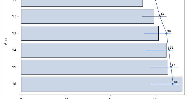
I previously showed how to create a decile calibration plot for a logistic regression model in SAS. A decile calibration plot (or "decile plot," for short) is used in some fields to visualize agreement between the data and a regression model. It can be used to diagnose an incorrectly specified
Tag: Statistical Graphics
I have previously written about how to plot a discontinuous function in SAS. That article shows how to use the GROUP= option on the SERIES statement to graph a discontinuous function. An alternative approach is to place a missing value for the Y variable at the locations at which the
The REFLINE statement in PROC SGPLOT is one of my favorite ways to augment statistical graphics such as scatter plots, series plots, and histograms. The REFLINE statement overlays a vertical or horizontal reference line on a graph. You can specify the location of the reference lines on the REFLINE statement.
The triangulation theorem for polygons says that every simple polygon can be triangulated. In fact, if the polygon has V vertices, you can decompose it into V-2 non-overlapping triangles. In this article, a "polygon" always means a simple polygon. Also, a "random point" means one that is drawn at random
A previous article discusses the confidence band for the mean predicted value in a regression model. The article shows a "graded confidence band plot," which I saw in Claus O. Wilke's online book, Fundamentals of Data Visualization (Section 16.3). It communicates uncertainty in the predictions. A graded band plot is
You've probably seen many graphs that are similar to the one at the right. This plot shows a regression line overlaid on a scatter plot of some data. Given a value for the independent variable (x), the regression line gives the best prediction for the mean of the response variable
The HighLow plot often enables you to create many custom plots without resorting to annotation. Although it is designed to create a candlestick chart for stocks, it is incredibly versatile. Recently, a SAS programmer wanted to create a patient-profile graph that looked like a stacked bar chart but had repeated
Sometimes in matrix computations, it is important to display the nonzero elements of a matrix. This can be useful for visualizing the structure of a sparse matrix (one that has many zeros) and it is also useful when describing a matrix algorithm (such as Gaussian elimination) that introduces zeros at
This article shows how to perform two-dimensional bilinear interpolation in SAS by using a SAS/IML function. It is assumed that you have observed the values of a response variable on a regular grid of locations. A previous article showed how to interpolate inside one rectangular cell. When you have a
I've previously written about linear interpolation in one dimension. Bilinear interpolation is a method for two-dimensional interpolation on a rectangle. If the value of a function is known at the four corners of a rectangle, an interpolation scheme gives you a way to estimate the function at any point in