A previous article describes the funnel plot (Spiegelhalter, 2005), which can identify samples that have rates or proportions that are much different than expected. The funnel plot is a scatter plot that plots the sample proportion of some quantity against the size of the sample. The variance of the sample
Tag: Statistical Graphics
Death is always a difficult topic to discuss, and death has been in the news a lot during this tragic coronavirus pandemic. Many news stories focus on states, counties, or cities that have the most cases or the most deaths. A related statistic is the case fatality rate, which is
I previously wrote about the advantages of adding horizontal and vertical reference lines to a graph. You can also add a diagonal reference line to a graph. The SGPLOT procedure in SAS supports two primary ways to add a diagonal reference line: The LINEPARM statement enables you to specify a
Data tell a story. A purpose of data visualization is to convey that story to the reader in a clear and impactful way. Sometimes you can let the data "speak for themselves" in an unadorned graphic, but sometimes it is helpful to add reference lines to a graph to emphasize
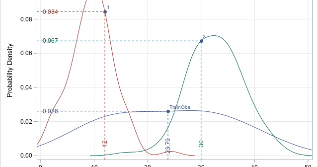
I have written several articles about how to work with continuous probability distributions in SAS. I always emphasize that it is important to be able to compute the four essential functions for working with a statistical distribution. Namely, you need to know how to generate random values, how to compute
During an epidemic, such as the coronavirus pandemic of 2020, the media often shows graphs of the cumulative numbers of confirmed cases for different countries. Often these graphs use a logarithmic scale for the vertical axis. In these graphs, a straight line indicates that new cases are increasing at an
A cumulative curve shows the total amount of some quantity at multiple points in time. Examples include: Total sales of songs, movies, or books, beginning when the item is released. Total views of blog posts, beginning when the post is published. Total cases of a disease for different countries, beginning
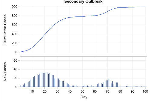
During an outbreak of a disease, such as the coronavirus (COVID-19) pandemic, the media shows daily graphs that convey the spread of the disease. The following two graphs appear frequently: New cases for each day (or week). This information is usually shown as a histogram or needle plot. The graph
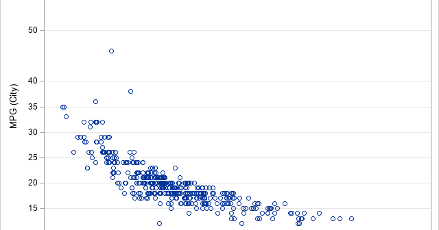
When you create a graph by using the SGPLOT procedure in SAS, usually the default tick locations are acceptable. Sometimes, however, you might want to specify a set of custom tick values for one or both axes. This article shows three examples: Specify evenly spaced values. Specify tick values that
A colleague recently posted an article about how to use SAS Visual Analytics to create a circular graph that displays a year's worth of temperature data. Specifically, the graph shows the air temperature for each day in a year relative to some baseline temperature, such as 65F (18C). Days warmer