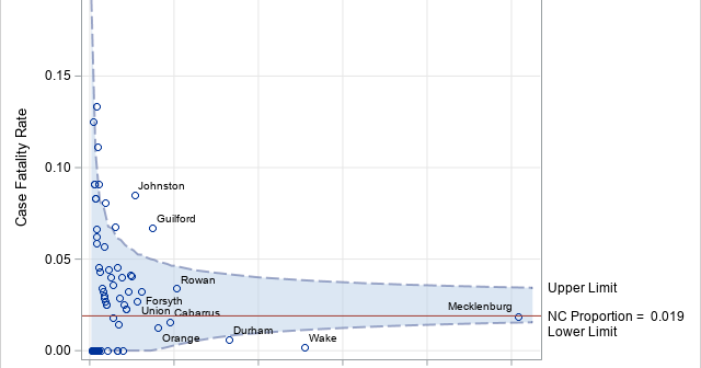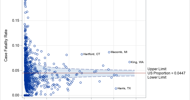
Computing rates and proportions is a common task in data analysis. When you are computing several proportions, it is helpful to visualize how the rates vary among subgroups of the population. Examples of proportions that depend on subgroups include: Mortality rates for various types of cancers Incarceration rates by race
Tag: Statistical Graphics
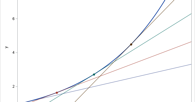
The EFFECT statement is supported by more than a dozen SAS/STAT regression procedures. Among other things, it enables you to generate spline effects that you can use to fit nonlinear relationships in data. Recently there was a discussion on the SAS Support Communities about how to interpret the parameter estimates
It is always great to read an old paper or blog post and think, "This task is so much easier in SAS 9.4!" I had that thought recently when I stumbled on a 2007 paper by Wei Cheng titled "Graphical Representation of Mean Measurement over Time." A substantial portion of
One of the strengths of the SAS/IML language is its flexibility. Recently, a SAS programmer asked how to generalize a program in a previous article. The original program solved one optimization problem. The reader said that she wants to solve this type of problem 300 times, each time using a
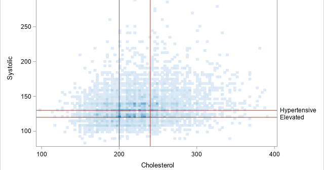
In a scatter plot that displays many points, it can be important to visualize the density of the points. Scatter plots (indeed, all plots that show individual markers) can suffer from overplotting, which means that the graph does not indicate how many observations are at a specific (x, y) location.
I often use axis tables in PROC SGPLOT in SAS to add a table of text to a graph so that the table values are aligned with the data. But axis tables are not the only way to display tabular data in a graph. You can also use the TEXT
The TEXT statement in PROC SGPLOT supports the ROTATE= option to rotate the specified text. It is worth knowing how the ROTATE= option interacts with the POSITION= option, which determines the anchor point at which the text is positioned. Briefly, the text is positioned FIRST, then the rotation occurs. The
A SAS programmer asked an intriguing question on the SAS Support Communities: Can you use SAS to create a graph that shows how the elements in a box-and-whiskers plot relate to the data? The SAS documentation has several examples that explain how to read a box plot. One of the
Heat maps have many uses. You can use a heat map to visualize correlation matrices, to visualize longitudinal data ("lasagna plots"), and to visualize counts in any two-dimensional table. As of SAS 9.4m3, you can create heat maps in SAS by using the HEATMAP and HEATMAPPARM statements in PROC SGPLOT.
I recently showed how to create an annotation data set that will overlay cell counts or percentages on a mosaic plot. A mosaic plot is a visual representation of a cross-tabulation of observed frequencies for two categorical variables. The mosaic plot with cell counts is shown to the right. The