The mosaic plot is a graphical visualization of a frequency table. In previous articles, I showed how to create a mosaic plot in SAS by using PROC FREQ and how to define a template in the Graph Template Language (GTL) by using the MOSAICPARM statement. This article shows how to
Tag: Statistical Graphics
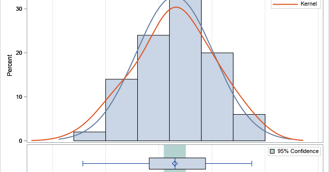
Math and statistics are everywhere, and I always rejoice when I spot a rather sophisticated statistical idea "in the wild." For example, I am always pleased when I see a graph that shows the distribution of race times in a typical race (such as a 5K), as shown to the
When fitting a least squares regression model to data, it is often useful to create diagnostic plots of the residuals versus the explanatory variables. If the model fits the data well, the plots of the residuals should not display any patterns. Systematic patterns can indicate that you need to include
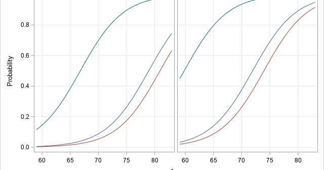
A family of curves is generated by an equation that has one or more parameters. To visualize the family, you might want to display a graph that overlays four of five curves that have different parameter values, as shown to the right. The graph shows members of a family of
Statistical programmers and analysts often use two kinds of rectangular data sets, popularly known as wide data and long data. Some analytical procedures require that the data be in wide form; others require long form. (The "long format" is sometimes called "narrow" or "tall" data.) Fortunately, the statistical graphics procedures
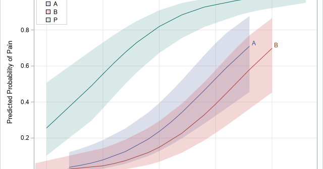
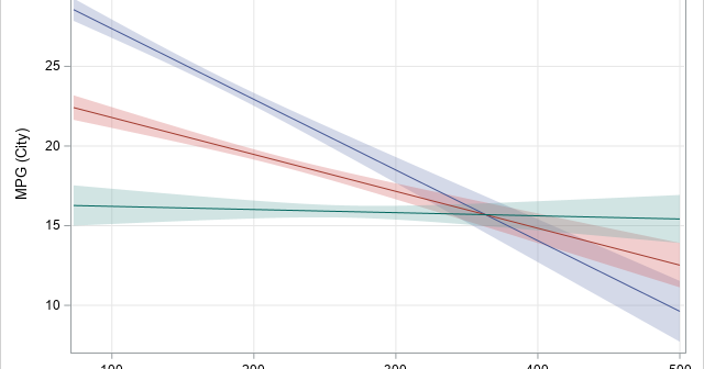
Knowing how to visualize a regression model is a valuable skill. A good visualization can help you to interpret a model and understand how its predictions depend on explanatory factors in the model. Visualization is especially important in understanding interactions between factors. Recently I read about work by Jacob A.
An analyst was using SAS to analyze some data from an experiment. He noticed that the response variable is always positive (such as volume, size, or weight), but his statistical model predicts some negative responses. He posted the data and asked if it is possible to modify the graph so
A previous article shows how to use a scatter plot to visualize the average SAT scores for all high schools in North Carolina. The schools are grouped by school districts and ranked according to the median value of the schools in the district. For the school districts that have many
Standardized tests like the SAT and ACT can cause stress for both high school students and their parents, but according to a Wall Street Journal article, the SAT and ACT "provide an invaluable measure of how students are likely to perform in college and beyond." Naturally, students wonder how their
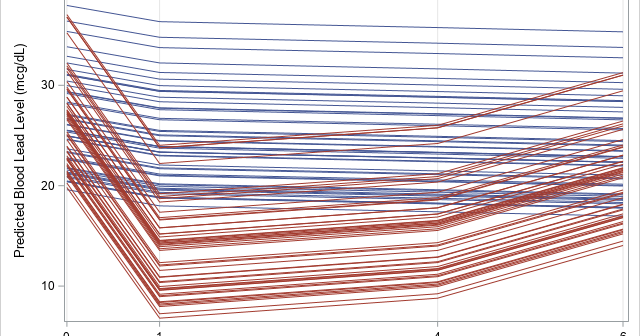
Box plots are a great way to compare the distributions of several subpopulations of your data. For example, box plots are often used in clinical studies to visualize the response of patients in various cohorts. This article describes three techniques to visualize responses when the cohorts have a nested or