Standardized tests like the SAT and ACT can cause stress for both high school students and their parents, but according to a Wall Street Journal article, the SAT and ACT "provide an invaluable measure of how students are likely to perform in college and beyond." Naturally, students wonder how their
Tag: Statistical Graphics
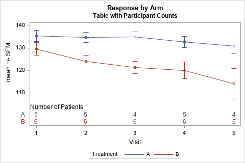
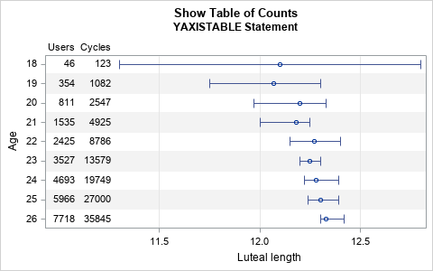
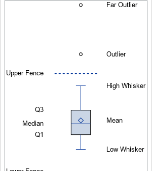
Box plots are a great way to compare the distributions of several subpopulations of your data. For example, box plots are often used in clinical studies to visualize the response of patients in various cohorts. This article describes three techniques to visualize responses when the cohorts have a nested or
When you overlay two series in PROC SGPLOT, you can either plot both series on the same axis or you can assign one series to the main axis (Y) and another to a secondary axis (Y2). If you use the Y and Y2 axes, they are scaled independently by default,
Numbers don't lie, but sometimes they don't reveal the full story. Last week I wrote about the most popular articles from The DO Loop in 2018. The popular articles are inevitably about elementary topics in SAS programming or statistics because those topics have broad appeal. However, I also write about
Last year, I wrote more than 100 posts for The DO Loop blog. Of these, the most popular articles were about data visualization, SAS programming tips, and statistical data analysis. Here are the most popular articles from 2018 in each category. Data Visualization Visualize repetition in song lyrics: In one
I regularly see questions on a SAS discussion forum about how to visualize the predicted values for a mixed model that has at least one continuous variable, a categorical variable, and possibly an interaction term. SAS procedures such as GLM, GENMOD, and LOGISTIC can automatically produce plots of the predicted
When a graph includes several markers or line styles, it is often useful to create a legend that explains the relationship between the data and the symbols, color, and line styles in the graph. The SGPLOT procedure does a good job of automatically creating and placing a legend for most
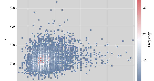
Last week my colleague, Robert Allison, visualized data regarding immunization rates for kindergarten classes in North Carolina. One of his graphs was a scatter plot that displayed the proportion of unimmunized students versus the size of the class for 1,885 kindergarten classes in NC. This scatter plot is the basis
The SGPLOT procedure enables you to use the value of a response variable to color markers or areas in a graph. For example, you can use the COLORRESPONSE= option to define a variable whose values will be used to color markers in a scatter plot or cells in a heat
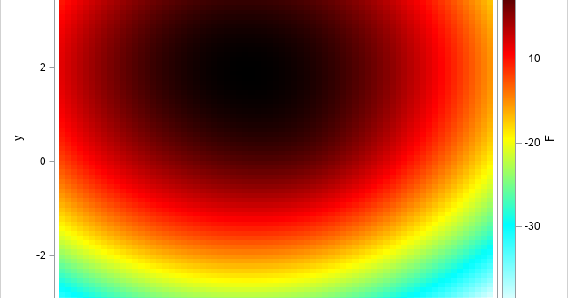
When solving optimization problems, it is harder to specify a constrained optimization than an unconstrained one. A constrained optimization requires that you specify multiple constraints. One little typo or a missing minus sign can result in an infeasible problem or a solution that is unrelated to the true problem. This