You've probably heard about the "80-20 Rule," which describes many natural and manmade phenomena. This rule is sometimes called the "Pareto Principle" because it was discovered by Vilfredo Pareto (1848–1923) who used it to describe the unequal distribution of wealth. Specifically, in his study, 80% of the wealth was held
Tag: Statistical Graphics
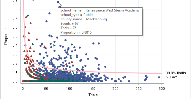
Simulation studies are used for many purposes, one of which is to examine how distributional assumptions affect the coverage probability of a confidence interval. This article describes the "zipper plot," which enables you to compare the coverage probability of a confidence interval when the data do or do not follow
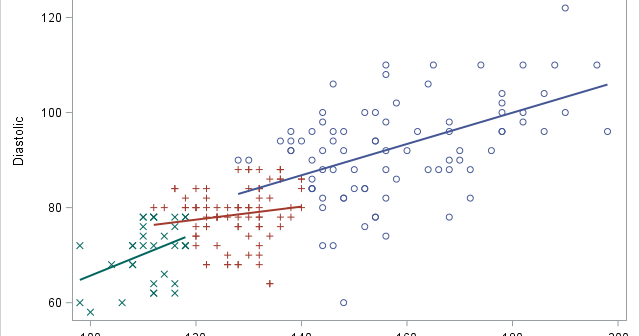
Did you know that SAS can combine or "merge" a symbol and a line pattern into a single legend item, as shown below? This kind of legend is useful when you are overlaying a group of curves onto a scatter plot. It enables the reader to quickly associate values of
This article shows how to construct a "stacked band plot" in SAS, as shown to the right. (Click to enlarge.) You are probably familiar with a stacked bar chart in which the cumulative amount of some quantity is displayed by stacking the contributions of several groups. A canonical example is
Money magazine (Jan/Feb 2018) contains an article about how much it costs to give birth in the US. The costs, which are based on insurance data, include prenatal care and hospital delivery but exclude infant care. The data are compiled for each state (including Washington, DC) and by type of
Last week I wrote about the 10 most popular articles from The DO Loop in 2017. My most popular articles tend to be about elementary statistics or SAS programming tips. Less popular are the articles about advanced statistical and programming techniques. However, these technical articles fill an important niche. Not
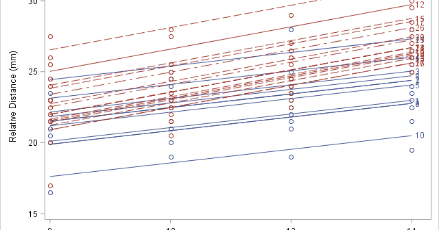
A SAS programmer asked how to label multiple regression lines that are overlaid on a single scatter plot. Specifically, he asked to label the curves that are produced by using the REG statement with the GROUP= option in PROC SGPLOT. He wanted the labels to be the slope and intercept
I previously showed an easy way to visualize a regression model that has several continuous explanatory variables: use the SLICEFIT option in the EFFECTPLOT statement in SAS to create a sliced fit plot. The EFFECTPLOT statement is directly supported by the syntax of the GENMOD, LOGISTIC, and ORTHOREG procedures in
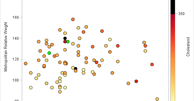
Missing values present challenges for the statistical analyst and data scientist. Many modeling techniques (such as regression) exclude observations that contain missing values, which can reduce the sample size and reduce the power of a statistical analysis. Before you try to deal with missing values in an analysis (for example,
This article demonstrates a SAS programming technique that I call Kuhfeld's template modification technique. The technique enables you to dynamically modify an ODS template and immediately call the modified template to produce a new graph or table. By following the five steps in this article, you can implement the technique