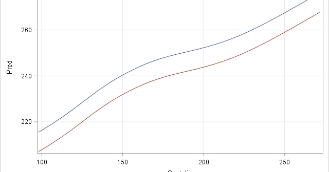
There are several ways to visualize data in a two-way ANOVA model. Most visualizations show a statistical summary of the response variable for each category. However, for small data sets, it can be useful to overlay the raw data. This article shows a simple trick that you can use to
Tag: Statistical Graphics
A reader commented on last week's article about constructing symmetric intervals. He wanted to know if I created it in SAS. Yes, the graph, which illustrates the so-called 68-95-99.7 rule for the normal distribution, was created by using several statements in the SGPLOT procedure in Base SAS The SERIES statement
Suppose you create a scatter plot in SAS with PROC SGPLOT. What color does PROC SGPLOT use for the markers? If you specify the GROUP= option so that markers are colored by a grouping variable, what colors are used to represent the various groups? The following scatter plot shows the
If you are a SAS programmer and use the GROUP= option in PROC SGPLOT, you might have encountered a thorny issue: if you use a WHERE clause to omit certain observations, then the marker colors for groups might change from one plot to another. This happens because the marker colors
“La Quinta” is Spanish for “next to Denny’s.” -- Mitch Hedberg, comedian Mitch Hedberg's joke resonates with travelers who drive on the US interstate system because many highway exits feature both a La Quinta Inn™ and a Denny's® restaurant within a short distance of each other. But does a
Do you want to create customized SAS graphs by using PROC SGPLOT and the other ODS graphics procedures? An essential skill that you need to learn is how to merge, join, append, and concatenate SAS data sets that come from different sources. The SAS statistical graphics procedures (SG procedures) enable
A SAS customer asked how to use background colors and a dashed line to emphasize the forecast region for a graph that shows a time series model. The task requires the following steps: Use the ATTRPRIORITY=NONE option on the ODS GRAPHICS statement to make sure that the current ODS style
Who was the oldest person elected president of the United States? How about the youngest? Who was the oldest when he left office? Let's look at some data. Wikipedia has a page that presents a table of the presidents of the US by age. It lists the dates for which
This article uses graphical techniques to visualize one of my favorite geometric objects: the surface of a three-dimensional torus. Along the way, this article demonstrates techniques that are useful for visualizing more mundane 3-D point clouds that arise in statistical data analysis. Define points on a torus A torus is
Rotation matrices are used in computer graphics and in statistical analyses. A rotation matrix is especially easy to implement in a matrix language such as the SAS Interactive Matrix Language (SAS/IML). This article shows how to implement three-dimensional rotation matrices and use them to rotate a 3-D point cloud. Define