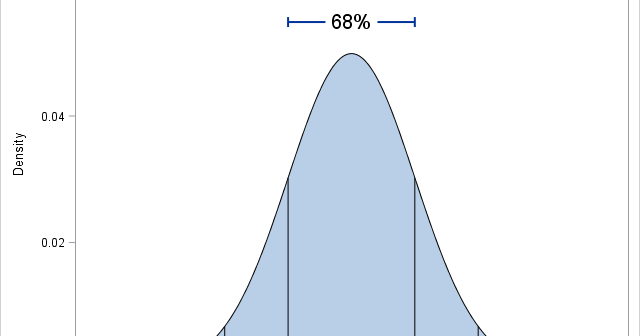
Graphs enable you to visualize how the predicted values for a regression model depend on the model effects. You can gain an intuitive understanding of a model by using the EFFECTPLOT statement in SAS to create graphs like the one shown at the top of this article. Many SAS regression
Tag: Statistical Graphics
I have previously shown how to overlay basic plots on box plots when all plots share a common discrete X axis. It is interesting to note that box plots can also be overlaid on a continuous (interval) axis. You often need to bin the data before you create the plot.
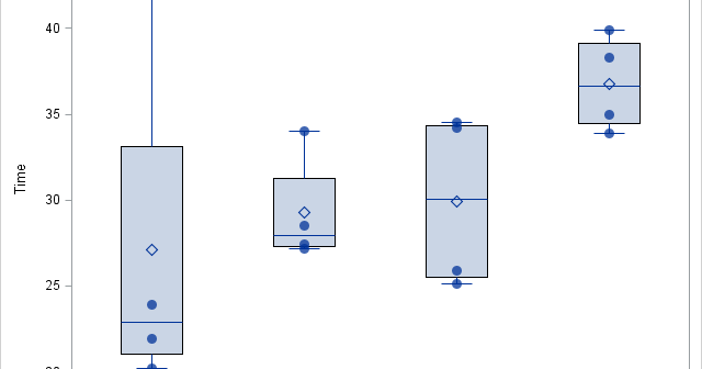
Box plots summarize the distribution of a continuous variable. You can display multiple box plots in a single graph by specifying a categorical variable. The resulting graph shows the distribution of subpopulations, such as different experimental groups. In the SGPLOT procedure, you can use the CATEGORY= option on the VBOX
Last week I discussed how to create spaghetti plots in SAS. A spaghetti plot is a type of line plot that contains many lines. Spaghetti plots are used in longitudinal studies to show trends among individual subjects, which can be patients, hospitals, companies, states, or countries. I showed ways to
What is a spaghetti plot? Spaghetti plots are line plots that involve many overlapping lines. Like spaghetti on your plate, they can be hard to unravel, yet for many analysts they are a delicious staple of data visualization. This article presents the good, the bad, and the messy about spaghetti
When I read Robert Allison's article about the cost of a taxi ride in New York City, I was struck by the scatter plot (shown at right; click to enlarge) that plots the tip amount against the total bill for 12 million taxi rides. The graph clearly reveals diagonal and
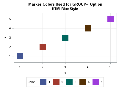
The SG procedures in SAS use aesthetically pleasing default colors, shapes, and styles, but sometimes it is necessary to override the default attributes. The MARKERATTRS= option enables you to override the default colors, symbols, and sizes of markers in scatter plots and other graphs. Similarly, the LINEATTRS= option enables you
You can use histograms to visualize the distribution of data. A comparative histogram enables you to compare two or more distributions, which usually represent subpopulations in the data. Common subpopulations include males versus females or a control group versus an experimental group. There are two common ways to construct a
Last week Sanjay Matange wrote about a new SAS 9.4m3 option that enables you to show all categories in a graph legend, even when the data do not contain all the categories. Sanjay's example was a chart that showed medical conditions classified according to the scale "Mild," "Moderate," and "Severe."
In SAS, the aspect ratio of a graph is the physical height of the graph divided by the physical width. Recently I demonstrated how to set the aspect ratio of graphs in SAS by using the ASPECT= option in PROC SGPLOT or by using the OVERLAYEQUATED statement in the Graph