Tag: Statistical Graphics

Rick Wicklin 8
Create spaghetti plots in SAS

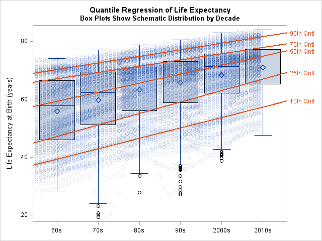
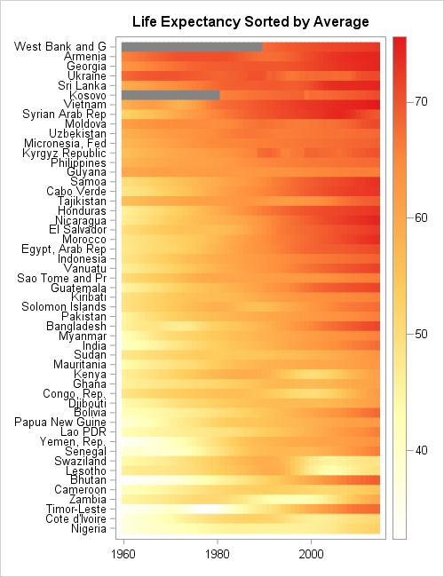
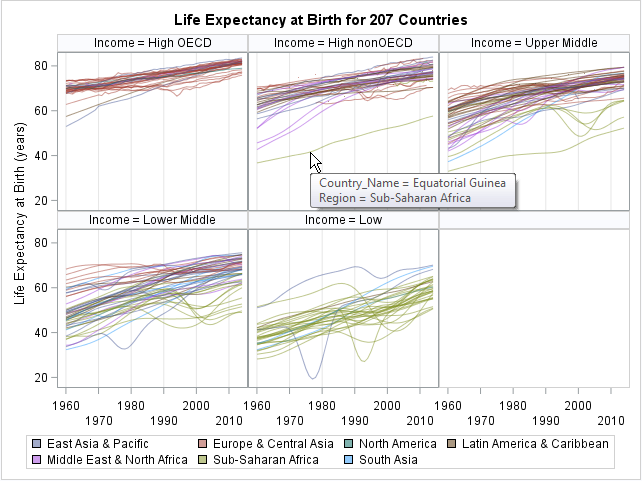
What is a spaghetti plot? Spaghetti plots are line plots that involve many overlapping lines. Like spaghetti on your plate, they can be hard to unravel, yet for many analysts they are a delicious staple of data visualization. This article presents the good, the bad, and the messy about spaghetti

Rick Wicklin 11
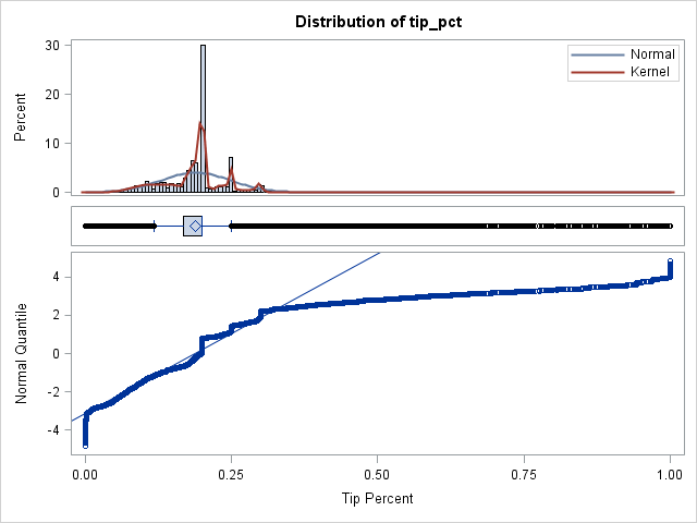
How much do New Yorkers tip taxi drivers?

When I read Robert Allison's article about the cost of a taxi ride in New York City, I was struck by the scatter plot (shown at right; click to enlarge) that plots the tip amount against the total bill for 12 million taxi rides. The graph clearly reveals diagonal and

Rick Wicklin 2
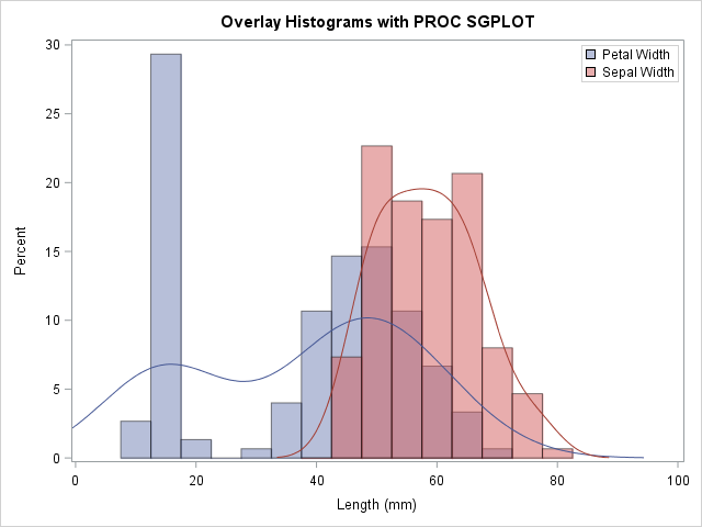
Overlay categories on a histogram

Recently Sanjay Matange blogged about how to color the bars of a histogram according to a gradient color ramp. Using the fact that bar charts and histograms look similar, he showed how to use PROC SGPLOT in SAS to plot a bar chart in which each bar is colored according

1 19 20 21 22 23 31