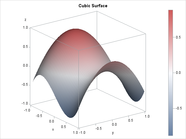
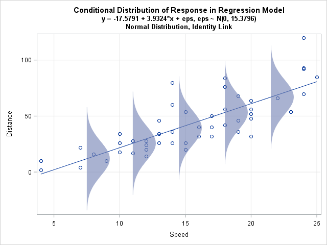
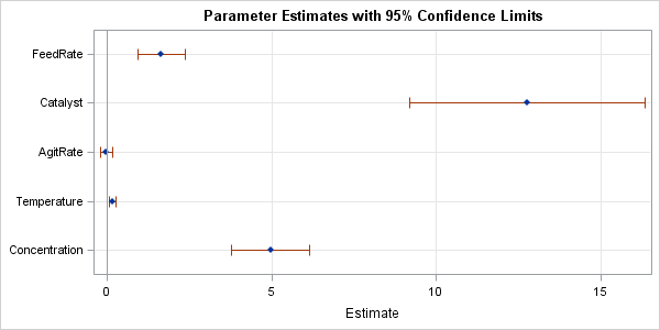
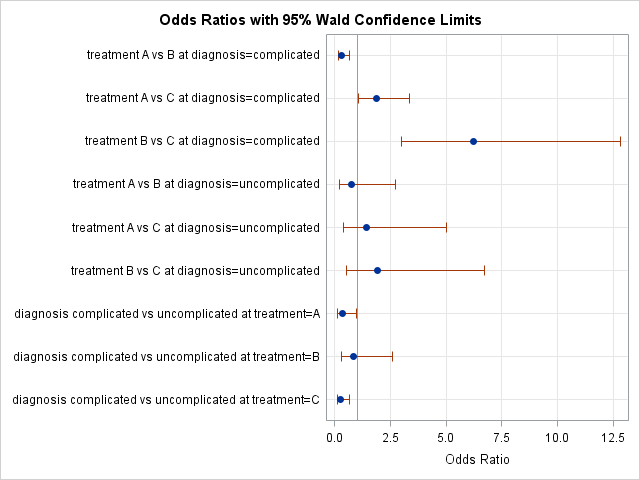
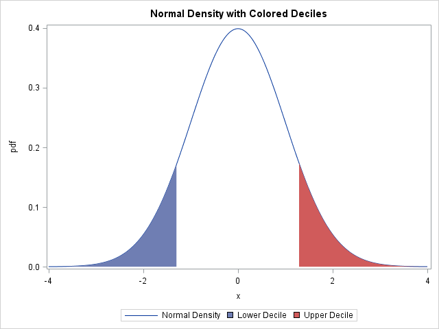
Have you ever looked as a statistical graph that uses bright garish colors and thought, "Why in the world did that guy choose those awful colors?" Don't be "that guy"! Your choice of colors for a graph can make a huge difference in how well your visualization is perceived by
Tag: Statistical Graphics
In a previous article I introduced the HEATMAPCONT subroutine in SAS/IML 13.1, which makes it easy to visualize matrices by using heat maps with continuous color ramps. This article introduces a companion subroutine. The HEATMAPDISC subroutine, which also requires SAS/IML 13.1, is designed to visualize matrices that have a small
While at JSM 2014 in Boston, a statistician asked me whether it was possible to create a "customized bin plot" in SAS. When I asked for more information, she told me that she has a large data set. She wants to visualize the data, but a scatter plot is not
In a previous blog post I showed how to order a set of variables by a statistic. After reshaping data, you can create a graph that contains box plots for many variables. Ordering the variables by some statistic (mean, median, variance,...) helps to differentiate and distinguish the variables. You can
When I create a graph of data that contains a categorical variable, I rarely want to display the categories in alphabetical order. For example, the box plot to the left is a plot of 10 standardized variables where the variables are ordered by their median value. The ordering makes it
While I was working on my recent blog post about two-dimensional binning, a colleague asked whether I would be discussing "the new hexagonal binning method that was added to the SURVEYREG procedure in SAS/STAT 13.2." I was intrigued: I was not aware that hexagonal binning had been added to a
In a previous blog post, I showed how to use the graph template language (GTL) in SAS to create heat maps with a continuous color ramp. SAS/IML 13.1 includes the HEATMAPCONT subroutine, which makes it easy to create heat maps with continuous color ramps from SAS/IML matrices. Typical usage includes
Heat maps have many uses. In a previous article, I showed how to use heat maps with a discrete color ramp to visualize matrices that have a small number of unique values, such as certain covariance matrices and sparse matrices. You can also use heat maps with a continuous color
In a previous blog post, I showed how to overlay a prediction ellipse on a scatter plot in SAS by using the ELLIPSE statement in PROC SGPLOT. The ELLIPSE statement draws the ellipse by using a standard technique that assumes the sample is bivariate normal. Today's article describes the technique
It is common in statistical graphics to overlay a prediction ellipse on a scatter plot. This article describes two easy ways to overlay prediction ellipses on a scatter plot by using SAS software. It also describes how to overlay multiple prediction ellipses for subpopulations. What is a prediction ellipse? A