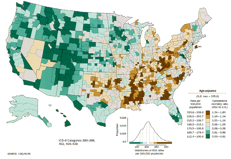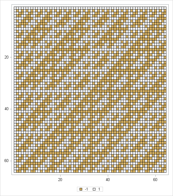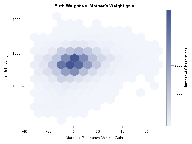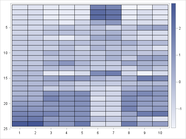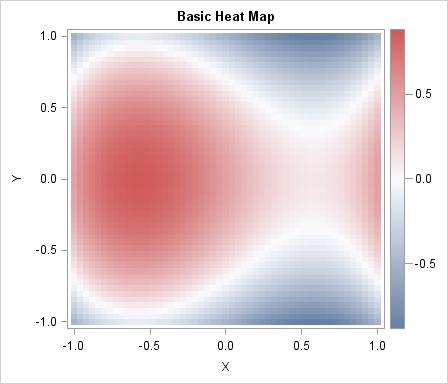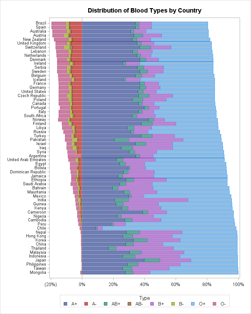
A heat map is a graphical representation of a matrix that uses colors to represent values in the matrix cells. Heat maps often reveal the structure of a matrix. There are three common applications of visualizing matrices with heat maps: Visualizing a correlation or covariance matrix reveals relationships between variables.
Tag: Statistical Graphics
The mosaic plot is a graphical visualization of a frequency table. In a previous post, I showed how to use the FREQ procedure to create a mosaic plot. This article shows how to create a mosaic plot by using the MOSAICPARM statement in the graph template language (GTL). (The MOSAICPARM
Mosaic plots (Hartigan and Kleiner, 1981; Friendly, 1994, JASA) are used for exploratory data analysis of categorical data. Mosaic plots have been available for decades in SAS products such as JMP, SAS/INSIGHT, and SAS/IML Studio. However, not all SAS customers have access to these specialized products, so I am pleased
On Kaiser Fung's Junk Charts blog, he showed a bar chart that was "published by Teach for America, touting its diversity." Kaiser objected to the chart because the bar lengths did not accurately depict the proportions of the Teach for America corps members. The chart bothers me for another reason:
A common visualization is to compare characteristics of two groups. This article emphasizes two tips that will help make the comparison clear. First, consider graphing the differences between the groups. Second, in any plot that has a categorical axis, sort the categories by a meaningful quantity. This article is motivated
How old is your version of SAS software? The graph on the left shows the release dates for various releases of SAS software, beginning with SAS 8.0. The graph is based on a graph on Jiangtang Hu's blog that shows the major SAS releases. As this graph demonstrates, SAS software
The CLUSTER procedure in SAS/STAT software creates a dendrogram automatically. The black-and-white dendrogram is nice, but plain. A SAS customer wanted to know whether it is possible to add color to the dendrogram to emphasize certain clusters. For example, the plot at the left emphasizes a four-cluster scenario for clustering
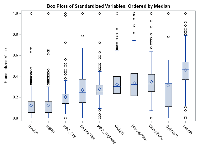
Suppose that you have several data distributions that you want to compare. Questions you might ask include "Which variable has the largest spread?" and "Which variables exhibit skewness?" More generally, you might be interested in visualizing how the distribution of one variable differs from the distribution of other variables. The
At a recent conference, I talked with a SAS customer who told me that he was using an R package to create a three-panel visualization of a distribution. Unfortunately, he couldn't remember the name of the package, and he has not returned my e-mails, so the purpose of today's article
I've previously described how to overlay two or more density curves on a single plot. I've also written about how to use PROC SGPLOT to overlay custom curves on a graph. This article describes how to overlay a density curve on a histogram. For common distributions, you can overlay a