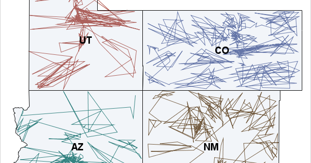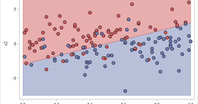
One of the strengths of the SGPLOT procedure in SAS is the ease with which you can overlay multiple plots on the same graph. For example, you can easily combine the SCATTER and SERIES statements to add a curve to a scatter plot. However, if you try to overlay incompatible
Tag: Statistical Graphics
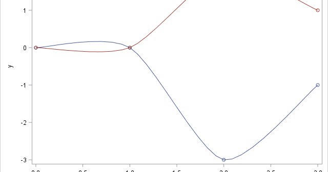
Last week I wrote about how to compute sample quantiles and weighted quantiles in SAS. As part of that article, I needed to draw some step functions. Recall that a step function is a piecewise constant function that jumps by a certain amount at a finite number of points. Graph
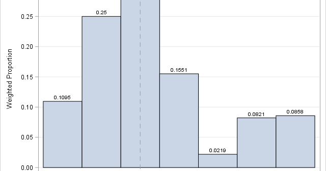
Many univariate descriptive statistics are intuitive. However, weighted statistic are less intuitive. A weight variable changes the computation of a statistic by giving more weight to some observations than to others. This article shows how to compute and visualize weighted percentiles, also known as a weighted quantiles, as computed by
It is easy to use PROC SGPLOT and BY-group processing to create an animated graph in SAS 9.4. Sanjay Matange previously discussed how to create an animated plot in SAS 9.4, but he used a macro loop to call PROC SGPLOT many times. It is often easier to use the
This week Hillary Clinton became the first woman to be nominated for president of the US by a major political party. Although this is a first for the US, many other countries have already passed this milestone. In fact, 60 countries have already elected women as presidents and prime ministers.
A kernel density estimate (KDE) is a nonparametric estimate for the density of a data sample. A KDE can help an analyst determine how to model the data: Does the KDE look like a normal curve? Like a mixture of normals? Is there evidence of outliers in the data? In
One of my favorite new features in PROC SGPLOT in SAS 9.4m2 is addition of the COLORRESPONSE= and COLORMODEL= options to the SCATTER statement. By using these options, it is easy to color markers in a scatter plot so that the colors indicate the values of a continuous third variable.
'Tis a gift to be simple. -- Shaker hymn In June 2015 I published a short article for Significance, a magazine that features statistical and data-related articles that are of general interest to a wide a range of scientists. The title of my article is "In Praise of Simple Graphics."
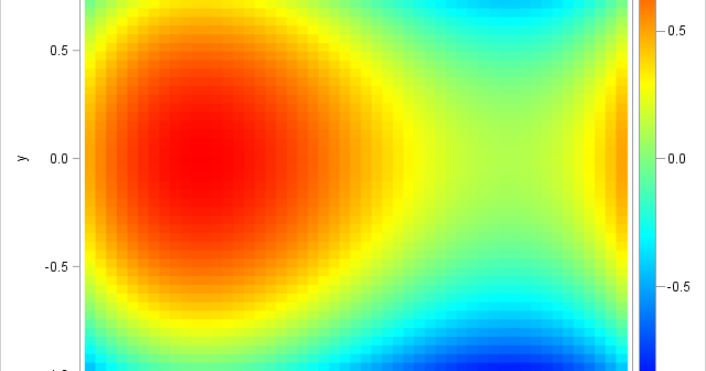
Graphs enable you to visualize how the predicted values for a regression model depend on the model effects. You can gain an intuitive understanding of a model by using the EFFECTPLOT statement in SAS to create graphs like the one shown at the top of this article. Many SAS regression
I have previously shown how to overlay basic plots on box plots when all plots share a common discrete X axis. It is interesting to note that box plots can also be overlaid on a continuous (interval) axis. You often need to bin the data before you create the plot.