In a previous article, I discussed the lines plot for multiple comparisons of means. Another graph that is frequently used for multiple comparisons is the diffogram, which indicates whether the pairwise differences between means of groups are statistically significant. This article discusses how to interpret a diffogram. Two related plots
Tag: Statistical Graphics
Last week Warren Kuhfeld wrote about a graph called the "lines plot" that is produced by SAS/STAT procedures in SAS 9.4M5. (Notice that the "lines plot" has an 's'; it is not a line plot!) The lines plot is produced as part of an analysis that performs multiple comparisons of
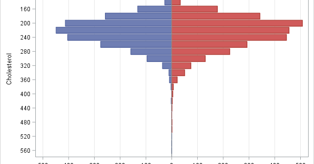
If you perform a weighted statistical analysis, it can be useful to produce a statistical graph that also incorporates the weights. This article shows how to construct and interpret a weighted histogram in SAS. How to construct a weighted histogram Before constructing a weighted histogram, let's review the construction of
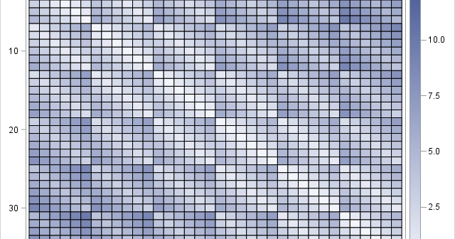
Toe bone connected to the foot bone, Foot bone connected to the leg bone, Leg bone connected to the knee bone,... — American Spiritual, "Dem Bones" Last week I read an interesting article on Robert Kosara's data visualization blog. Kosara connected the geographic centers of the US zip codes in
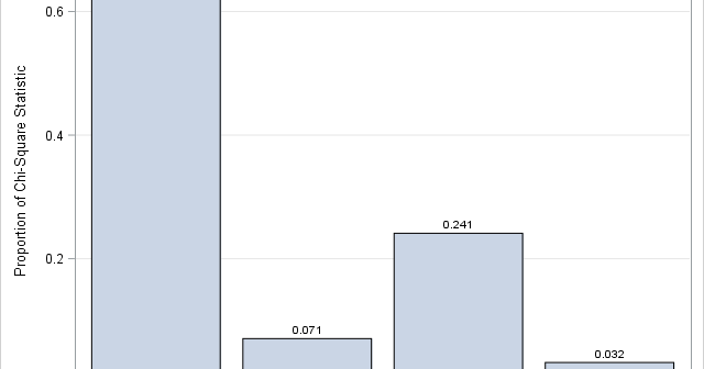
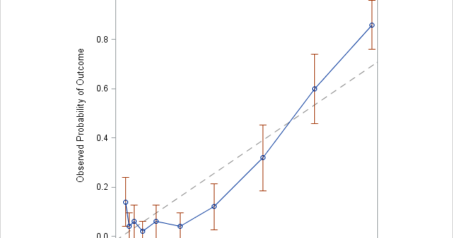
An important problem in machine learning is the "classification problem." In this supervised learning problem, you build a statistical model that predicts a set of categorical outcomes (responses) based on a set of input features (explanatory variables). You do this by training the model on data for which the outcomes
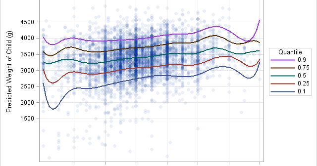
By default, when you use the SERIES statement in PROC SGPLOT to create a line plot, the observations are connected (in order) by straight line segments. However, SAS 9.4m1 introduced the SMOOTHCONNECT option which, as the name implies, uses a smooth curve to connect the observations. In Sanjay Matange's blog,
If a financial analyst says it is "likely" that a company will be profitable next year, what probability would you ascribe to that statement? If an intelligence report claims that there is "little chance" of a terrorist attack against an embassy, should the ambassador interpret this as a one-in-a-hundred chance,
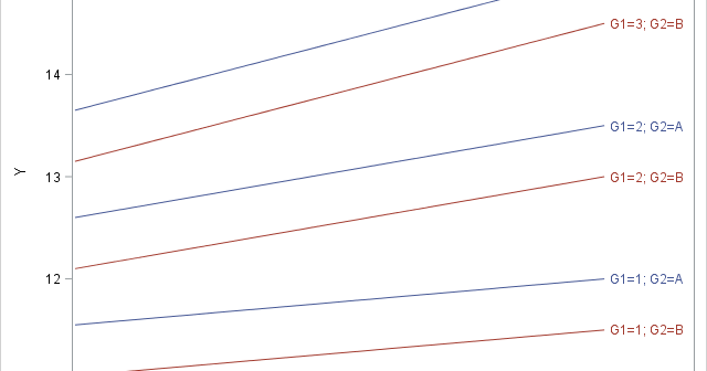
Most SAS regression procedures support a CLASS statement which internally generates dummy variables for categorical variables. I have previously described what dummy variables are and how are they used. I have also written about how to create design matrices that contain dummy variables in SAS, and in particular how to
There are several ways to visualize data in a two-way ANOVA model. Most visualizations show a statistical summary of the response variable for each category. However, for small data sets, it can be useful to overlay the raw data. This article shows a simple trick that you can use to
A reader commented on last week's article about constructing symmetric intervals. He wanted to know if I created it in SAS. Yes, the graph, which illustrates the so-called 68-95-99.7 rule for the normal distribution, was created by using several statements in the SGPLOT procedure in Base SAS The SERIES statement