Many SAS procedures can automatically create a graph that overlays multiple prediction curves and their prediction limits. This graph (sometimes called a "fit plot" or a "sliced fit plot") is useful when you want to visualize a model in which a continuous response variable depends on one continuous explanatory variable and one categorical (classification) variable. You can use the EFFECTPLOT statement in PROC PLM to create similar visualizations of other kinds of regression models. This article shows three ways to create a sliced fit plot: direct from the procedure, by using the EFFECTPLOT statement in PROC PLM, and by writing the predictions to a data set and using PROC SGPLOT to graph the results.
The data for this example is from the PROC LOGISTIC documentation. The response variable is the presence or absence of pain in seniors who are splits into two treatment groups (A and B) and a placebo group (P).
Data Neuralgia; input Treatment $ Sex $ Age Duration Pain $ @@; datalines; P F 68 1 No B M 74 16 No P F 67 30 No P M 66 26 Yes B F 67 28 No B F 77 16 No A F 71 12 No B F 72 50 No B F 76 9 Yes A M 71 17 Yes A F 63 27 No A F 69 18 Yes B F 66 12 No A M 62 42 No P F 64 1 Yes A F 64 17 No P M 74 4 No A F 72 25 No P M 70 1 Yes B M 66 19 No B M 59 29 No A F 64 30 No A M 70 28 No A M 69 1 No B F 78 1 No P M 83 1 Yes B F 69 42 No B M 75 30 Yes P M 77 29 Yes P F 79 20 Yes A M 70 12 No A F 69 12 No B F 65 14 No B M 70 1 No B M 67 23 No A M 76 25 Yes P M 78 12 Yes B M 77 1 Yes B F 69 24 No P M 66 4 Yes P F 65 29 No P M 60 26 Yes A M 78 15 Yes B M 75 21 Yes A F 67 11 No P F 72 27 No P F 70 13 Yes A M 75 6 Yes B F 65 7 No P F 68 27 Yes P M 68 11 Yes P M 67 17 Yes B M 70 22 No A M 65 15 No P F 67 1 Yes A M 67 10 No P F 72 11 Yes A F 74 1 No B M 80 21 Yes A F 69 3 No ; |
Automatically create a sliced fit plot
Many SAS regression procedures support the PLOTS= option on the PROC statement. For PROC LOGISTIC, the option that creates a sliced fit plot is the PLOTS=EFFECTPLOT option, and you can add prediction limits to the graph by using the CLBAND suboption, as follows:
proc logistic data=Neuralgia alpha=0.2 plots(only)=effectplot(clband); class Treatment; model Pain(Event='Yes')= Treatment Age; run; |
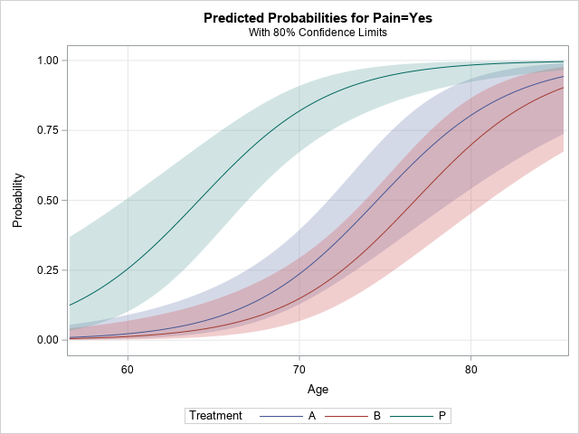
That was easy! The procedure automatically creates a title, legend, axis labels, and so forth. By using the PLOTS= option, you get a very nice plot that shows the predictions and prediction limits for the model.
Create a sliced fit plot by using PROC PLM
One of the nice things about the STORE statement in SAS regression procedures is that it enables you to create graphs and perform other post-fitting analyses without rerunning the procedure. Maybe you intend to examine many models before deciding on the best model. You can run goodness-of-fit statistics for the models and then use PROC PLM to create a sliced fit plot for only the final model. To do this, use the STORE statement in the regression procedure and then "restore" the model in PROC PLM, which can perform several post-fitting analyses, including creating a sliced fit plot, as follows:
proc logistic data=Neuralgia alpha=0.2 noprint; class Treatment; model Pain(Event='Yes')= Treatment Age; store PainModel / label='Neuralgia Study'; run; proc plm restore=PainModel noinfo; effectplot slicefit(x=Age sliceby=Treatment) / clm; run; |
The sliced fit plot is identical to the one that is produced by PROC LOGISTIC and is not shown.
Create a sliced fit plot manually
For many situations, the statistical graphics that are automatically produced are adequate. However, at times you might want to customize the graph by changing the title, the placement of the legend, the colors, and so forth. Sometimes companies mandate color-schemes and fonts that every report must use. For this purpose, SAS supports ODS styles and templates, which you can use to permanently change the output of SAS procedures. However, in many situations, you just want to make a small one-time modification. In that situation, it is usually simplest to write the predictions to a SAS data set and then use PROC SGPLOT to create the graph.
It is not hard to create a sliced fit plot. For these data, you can perform three steps:
- Write the predicted values and upper/lower prediction limits to a SAS data set.
- Sort the data by the classification variable and by the continuous variable.
- Use the BAND statement with the TRANSPARENCY= option to plot the confidence bands. Use the SERIES statement to plot the predicted values.
You can use the full power of PROC SGPLOT to modify the plot. For example, the following statements label the curves, move the legend, and change the title and Y axis label:
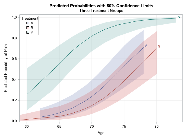
proc logistic data=Neuralgia alpha=0.2 noprint; class Treatment; model Pain(Event='Yes')= Treatment Age; /* 1. Use a procedure or DATA step to write Pred, Lower, and Upper limits */ output out=LogiOut pred=Pred lower=Lower upper=Upper; run; /* 2. Be sure to SORT! */ proc sort data=LogiOut; by Treatment Age; run; /* 3. Use a BAND statement. If more that one band, use transparency */ title "Predicted Probabilities with 80% Confidence Limits"; title2 "Three Treatment Groups"; proc sgplot data=LogiOut; band x=Age lower=Lower upper=Upper / group=Treatment transparency=0.75 name="L"; series x=Age y=Pred / group=Treatment curvelabel; xaxis grid; yaxis grid label="Predicted Probability of Pain" max=1; keylegend "L" / location=inside position=NW title="Treatment" across=1 opaque; run; |
The graph is shown at the top of this article. It has a customized title, label, and legend. In addition, the curves on this graph differ from the curves on the previous graph. The OUTPUT statement evaluates the model at the observed values of Age and Treatment. Notice that the A and B treatment groups do not have any patients that are over the age of 80, therefore those prediction curves do not extend to the right-hand side of the graph.
In summary, there are three ways to visualize predictions and confidence bands for a regression model in SAS. This example used PROC LOGISTIC, but many other regression procedures support similar options. In most SAS/STAT procedures, you can use the PLOTS= option to obtain a fit plot or a sliced fit plot. More than a dozen procedures support the STORE statement, which enables you to use PROC PLM to create the visualization. Lastly, all regression procedures support some way to output predicted values to a SAS data set. You can sort the data, then use the BAND statement (with transparency) and the SERIES statement to create the sliced fit plot.
