The DO Loop
Statistical programming in SAS with an emphasis on SAS/IML programs
The SELECT-WHEN statement in the SAS DATA step is an alternative to using a long sequence of IF-THEN/ELSE statements. Although logically equivalent to IF-THEN/ELSE statements, the SELECT-WHEN statement can be easier to read. This article discusses the two distinct ways to specify the SELECT-WHEN statement. You can use the first

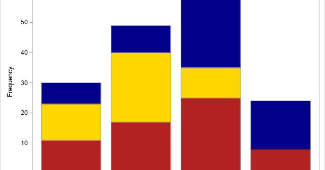
A SAS programmer was trying to understand how PROC SGPLOT orders categories and segments in a stacked bar chart. As with all problems, it is often useful to start with a simpler version of the problem. After you understand the simpler situation, you can apply that understanding to the more

A SAS programmer asked how to display long labels at irregular locations along the horizontal axis of scatter plot. The labels indicate various phases of a clinical study. This article discusses the problem and shows how to use the FITPOLICY=STAGGER option on the XAXIS or X2AXIS statement to avoid collisions
