The DO Loop
Statistical programming in SAS with an emphasis on SAS/IML programs
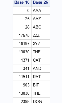
I recently showed how to represent positive integers in any base and gave examples of base 2 (binary), base 8 (octal), and base 16 (hexadecimal). One fun application is that you can use base 26 to associate a positive integer to every string of English characters. This article shows how

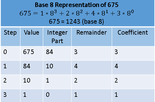
An integer can be represented in many ways. This article shows how to represent a positive integer in any base b. The most common base is b=10, but other popular bases are b=2 (binary numbers), b=8 (octal), and b=16 (hexadecimal). Each base represents integers in different ways. Think of a

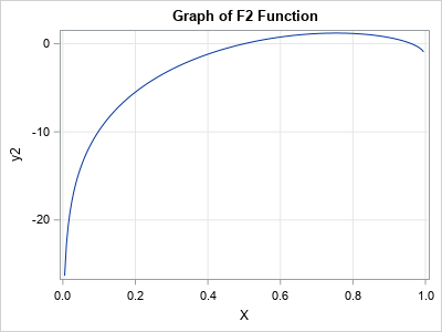
Monotonic transformations occur frequently in math and statistics. Analysts use monotonic transformations to transform variable values, with Tukey's ladder of transformations and the Box-Cox transformations being familiar examples. Monotonic distributions figure prominently in probability theory because the cumulative distribution is a monotonic increasing function. For a continuous distribution that is
