The DO Loop
Statistical programming in SAS with an emphasis on SAS/IML programs
This article is about how to use Git to share SAS programs, specifically how to share libraries of SAS IML functions. Some IML programmers might remember an earlier way to share libraries of functions: SAS/IML released "packages" in SAS 9.4m3 (2015), which enable you to create, document, share, and use

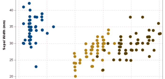
SAS supports the ColorBrewer system of color palettes from the ColorBrewer website (Brewer and Harrower, 2002). The ColorBrewer color ramps are available in SAS by using the PALETTE function in SAS IML software. The PALETTE function supports all ColorBrewer palettes, but some palettes are not interpretable by people with color

Did you know that about 8% of the world's men are colorblind? (More correctly, 8% of men are "color vision deficient," since they see colors, but not all colors.) Because of the "birthday paradox," in a room that contains eight men, the probability is 50% that at least one is
