The DO Loop
Statistical programming in SAS with an emphasis on SAS/IML programs
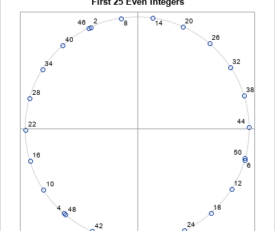
On this Pi Day, let's explore the "πth roots of unity." (Pi Day is celebrated in the US on 3/14 to celebrate π ≈ 3.14159....) It's okay if you've never heard of the πth roots of unity. This article starts by reviewing the better-known nth roots of unity. It then

Did you know that you can use π to partition the positive integers into two disjoint groups? It's not hard. One group is generated by the integer portions of multiples of π. The FLOOR function gives the integer portion of a positive number, so you can write integer that are

I previously showed how to use SAS to compute finite-difference derivatives for smooth scalar-valued functions of several variables. You can use the NLPFDD subroutine in SAS/IML software to approximate the gradient vector (first derivatives) and the Hessian matrix (second derivatives). The computation uses finite-difference derivatives to approximate the derivatives. The
