Years ago, I wrote an article about how to create a Top 10 table and bar chart. The program can be trivially modified to create a "Top N" table and plot, such as Top 5, Top 20, or even Top 100. Not long after the article was written, the developer of PROC FREQ (who had read my blog post) implemented the MAXLEVELS= option on the TABLES statement in PROC FREQ in SAS 9.4. The MAXLEVELS= option automatically creates these tables and plots for you! The option applies only to one-way tables, not to cross tabulations.
A Top 10 plot and bar chart
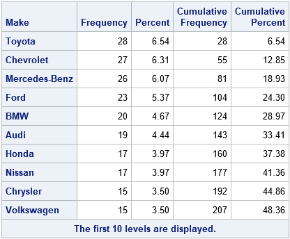
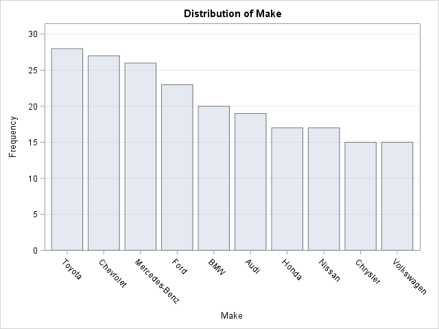
Suppose you want to see the Top 10 manufacturers of vehicles in the Sashelp.Cars data set. The following call to PROC FREQ uses the MAXLEVELS=10 option to create a Top 10 table and a bar chart of the 10 manufacturers who appear most often in the data:
%let TopN = 10; proc freq data=sashelp.cars ORDER=FREQ; tables make / maxlevels=&TopN Plots=FreqPlot; run; |
A few comments about the MAXLEVELS= option:
- The option affects only the display of the table and chart. The statistics (cumulative counts, percentages, chi-square tests,...) are all based on the full data and all categories. Similarly, if you use the OUT= option to write the counts to an output data set, the data set will contain the counts for all categories, not just the top categories.
- The "OneWayFreqs" table contains a note at the bottom to remind you that you are looking at a partial table. You can also see that the "Cumulative Percent" column does not end at 100.
- The PLOTS=FREQPLOT option contains suboptions that you can use to control aspects of the plot. For example, if you want a horizontal bar chart that shows percentages instead of counts, use the option plots=FreqPlot(orient=horizontal scale=percent).
Sometimes a small change can make a big difference. Although it is not difficult to follow the steps in the original article to create a Top 10 table and chart, the MAXLEVELS= option is even easier.
A Top 10 plot with an "Others" category
For completeness, the following statements are reproduced from an earlier article that shows how to merge the low-frequency categories into a new category with the value "Others." The resulting bar chart shows the most frequent categories and lumps the others into an "Others" category.
%let TopN = 10; %let VarName = Make; proc freq data=sashelp.cars ORDER=FREQ noprint; /* no print. Create output data set of all counts */ tables &VarName / out=TopOut; run; data Other; /* keep the values for the Top categories. Use "Others" for the smaller categories */ set TopOut; label topCat = "Top Categories or 'Other'"; topCat = &VarName; /* name of original categorical var */ if _n_ > &TopN then topCat = "Other"; /* merge smaller categories */ run; proc freq data=Other ORDER=data; /* order by data and use WEIGHT statement for counts */ tables TopCat / plots=FreqPlot(scale=percent); weight Count; run; |
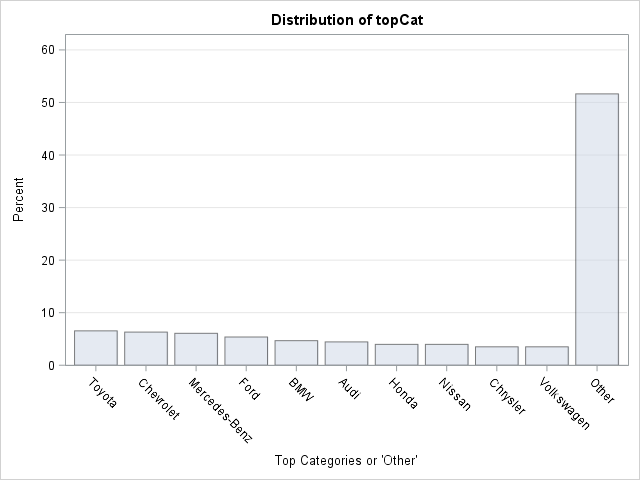
In the second PROC FREQ analysis, the smaller categories are merged into a new category called "Others." The "Others" category is suitable for tabular and graphical reporting, but you should think carefully before running statistical tests. As this example shows, the distribution of the new categorical variable might be quite different from the distribution of the original variable.

4 Comments
That's cool to learn the history of the MAXLEVELS= option! #loveyourwork! :-)
Thanks a lot sir. You are an erudite SAS developer.
This is really cool, I didn't know about it until today! With the plot options, how do I re-label the in the axis and also having a title embedded within the plot (e.g. distribution of topcat in your example above)