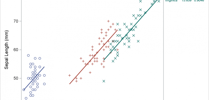
Usually, you use axis tables when there is a clear link between the rows of the axis table and the graph. I'll show how to use an axis table to create a table that is independent of the graph. This post also uses discrete attribute maps.

Usually, you use axis tables when there is a clear link between the rows of the axis table and the graph. I'll show how to use an axis table to create a table that is independent of the graph. This post also uses discrete attribute maps.
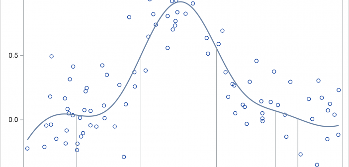
This post shows you how to run PROC SGPLOT, create smooth curves by using penalized B-splines, use ODS OUTPUT to create an output data set from PROC SGPLOT, and process it to display drop lines.
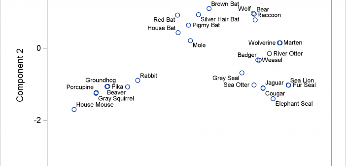
The POSITION= option in the TEXT statement provides you with a way to position text in a variety of locations relative to a point. You can use this option to fine tune label placement in a plot primarily created by using the SCATTER statement and the DATALABEL= option.

This post shows you how to animate text to create a message that appears one character at a time.

I hope everyone has noticed some new shortcuts in Graphically Speaking. As you scroll down and look to the right, there are shortcuts for Sanjay's getting started and clinical graphs posts and one for my advanced blogs. When Sanjay asked me to make an icon for my advanced blogs, at
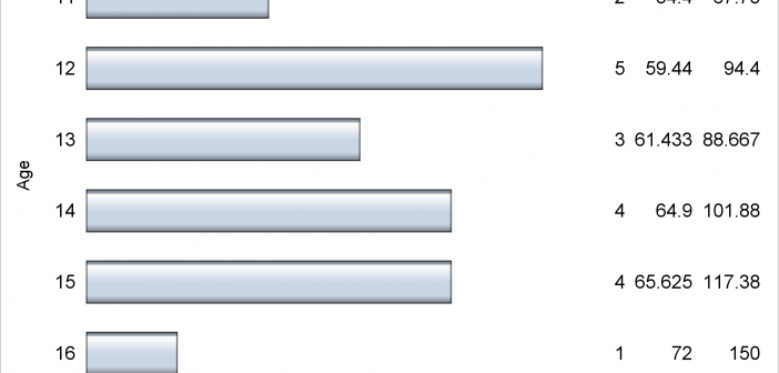
Axis tables can use the SUM= option to summarize data and display means, medians, sums, and percentages. They can instead be used to display data, text, and statistics without any summarization.
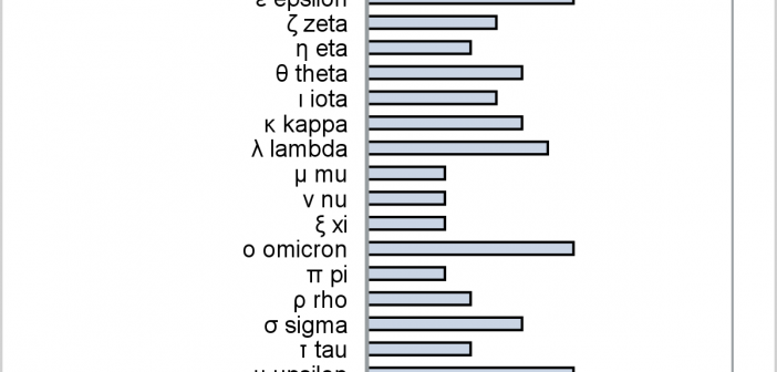
This post provides a general macro that enables you to easily display special characters (Unicode) in axis table columns.
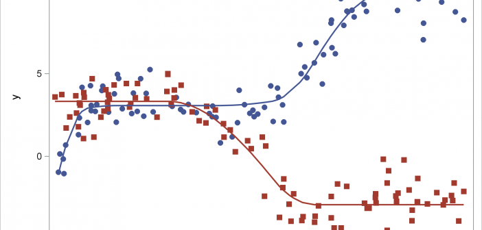
This post shows how to use PROC SGPLOT together with PROC TRANSREG to fit monotonically increasing or decreasing functions through a scatter plot.
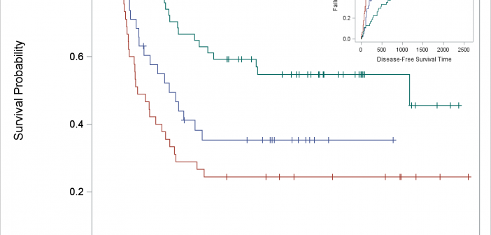
You can use SG Annotation (and its GTL equivalent) to display one graph inside another.
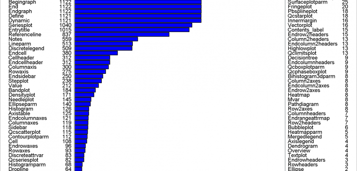
This post shows a variety of techniques including how to use PROC TEMPLATE and the SOURCE statement, PROC SGPLOT with multiple Y-axis tables, create comparable axes in two side-by-side graphs, create a broken axis, write and use a table template that wraps text, and find and display examples of certain statements in graph templates and fonts in style templates.