Tag: GTL

Data Visualization
Sanjay Matange 0
Broken Y-Axis with SAS 9.2

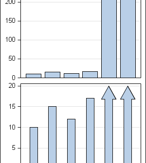
In the previous post on Broken Y-Axis, I reviewed different ways to display data as a Bar Chart, where the response values for some categories are many orders of magnitude larger than the other values.  These tall bars force  the display of other values to be squeezed down thus making it harder to compare

Data Visualization
Sanjay Matange 4
Broken Y-Axis

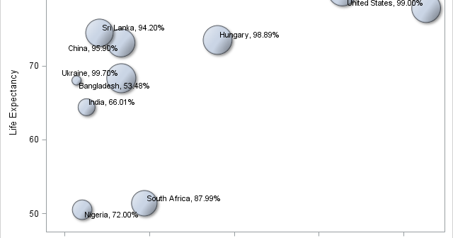
Often we want to display data as a bar chart where a few observations have large values compared to the rest.  Comparison between the smaller values becomes hard as the small bars are squeezed by the tall bars.  Here is an example data, and a bar chart showing the data. The large values

Data Visualization
Sanjay Matange 0
PharmaSUG 2012 update

PharmaSUG 2012 conference drew to a close today, concluding two and a half days packed with papers, presentations, posters, hands-on demos and super demos by SAS staff.  While the weather outside was a bit chilly from time to time, the conference what hopping with many user papers on how to

Data Visualization
Sanjay Matange 3
Just a legend, please

Recently, an interesting question was posed on the previous article on this blog by a reader.  Can we use the new DiscreteAttrMap feature to create just a legend with specific entries, with no graph.  The question was intriguing enough that I did not wait to ask - "Why?".  I just got

Data Visualization
Sanjay Matange 4
Simpler is better

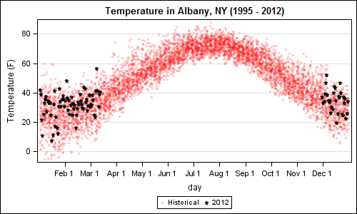
A recent article in the SAS and R blog was about current winter temperatures in Albany, NY.  The temperature data for the recent winter (Dec 2011 - Mar 2012) was plotted on a polar graph. Robert Allison posted an article on displaying the same data as a Polar Graph using SAS/GRAPH .  Here is his

Data Visualization
Sanjay Matange 2
Let them eat pie

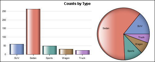
ODS Graphics system was initially motivated by the need for high quality graphs for SAS Base, STAT, and other analytical procedures.  Use of SG Procedures, ODS Graphics Designer and GTL by users too has initially focused on analytical graphs.  But just like wheels on carryon bags that started for the specific needs of flight

Data Visualization
Sanjay Matange 4
Beer, diapers and heat map

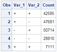
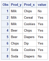
The parable of beer and diapers is often related when teaching data mining techniques.  Whether fact or fiction, a Heat Map is useful to view the claimed associations.  A co-worker recently enquired about possible ways to display associations or dependency between variables.  One option is to show the dependency as a node

1 7 8 9 10