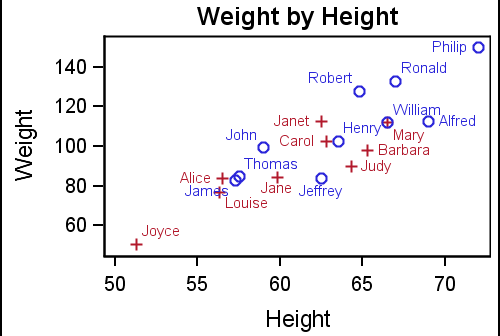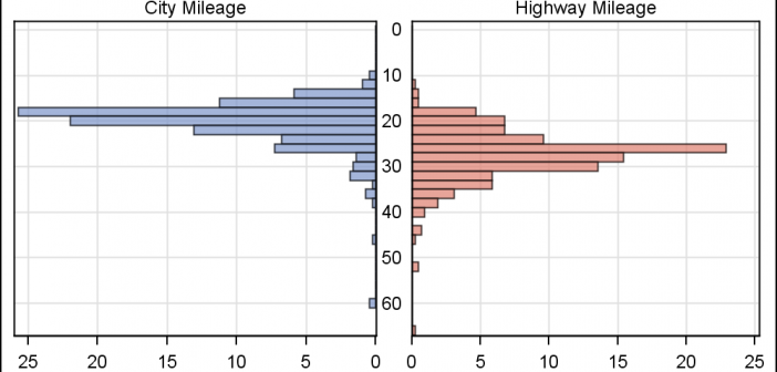
In reference to a previous article on Violin Plots, a reader asked about creating comparative mirrored histograms to compare propensity scores. While I had my own understanding of "Mirrored Histograms", I also looked this up on the web. Google showed many cases of two histograms back to back, either horizontally or vertically.
Tag: GTL
In the first article on Getting Started with GTL, we discussed the basics on how to create a graph using the Graph Template Language. This involved the creation of a "statgraph" template using the TEMPLATE procedure, and then associating data with the template to create the graph using the SGRENDER
I am happy to report that my new book "Getting Started with the Graph Template Language in SAS" is now shipping. A colleague suggest it would be useful to post some articles with the same theme of "Getting started". I thought that was a great idea, and decided to start a new
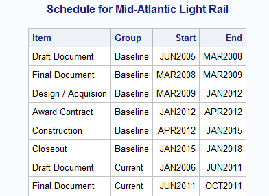
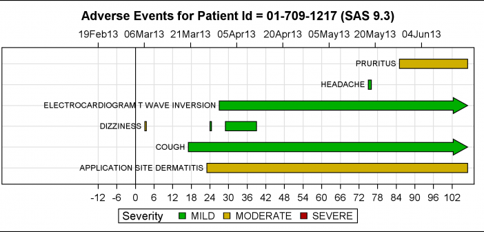
Last week Bruno asked about creating a Schedule Chart using SG Procedures. To me, such projects are very interesting and challenging...How much mileage can we get out of the current set of SGPLOT procedure features to create a visual that was not part of the original requirements? The clear choice for
Yesterday I read a Christina's blog article on the winners of the Best Presentations honor at MWSUG 2013. Two papers caught my (graphical) eye, both by Perry Watts. Perry has done a marvelous job describing how creatively use GTL to make graphs that may not be obvious at first glance.
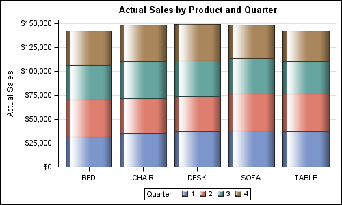
Creating bar charts with group classification is very easy using the SG procedures. When using a group variable, the group values for each category are stacked by default. Using the sashelp.prdsale data set and default STAT of SUM, here is the graph and the code. SGPLOT code: proc sgplot data=sashelp.prdsale;
SAS 9.4 was released a month ago, and we are excited about all the new features in SG Procedures, GTL and Designer. I wrote an article on SAS 9.4 graph features last month, and promised more to come. What then could be better than this Tech Talk video hosted by our
Last week, I presented some highlights of the new features for SG Procedures and GTL in SAS 9.4. Now, let us dig in a bit deeper. For a plot without a GROUP role, setting an attributes was always easy with SG procedures. All you need to do to set bar color
Recently a user chimed in on the SAS Communities page, requesting a way to add some observation level annotation to a box plot. Wendy was delighted to see a graph created by the UNIVARIATE procedure called "Schematic Plot". In this graph, the box plot of the analysis variable is shown with
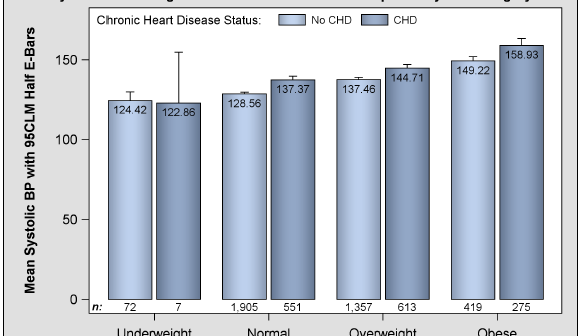
The PharmaSUG 2013 conference in Chicago this week was awesome. From the perspective of graphics, there was great interest in using SG Procedures, Designer and GTL for building clinical graphs. It was nice to see many papers by users on how they are using these tools for creating graphs on a daily