Tag: GTL

Data Visualization
Sanjay Matange 1
The HIGHLOW Plot

SG Procedures and GTL provide you with a large set of plot statements, such as BarChart, ScatterPlot, BoxPlot and more.  You can use them for the intended purpose, and all is well and good.  However, the real fun starts when you leverage a plot to do something that was not

Data Visualization
Sanjay Matange 7
Multi-Group Series Plots

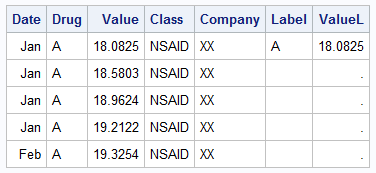
The series plot is a popular way to visualize response data over a continuous axis like date with a group variable like treatment.   Here is some data I made up of a response value by date, treatment, classification and company that makes the drug.  The data is simulated as shown in the attached program

Data Visualization
Sanjay Matange 3
Sochi Medal Graphs

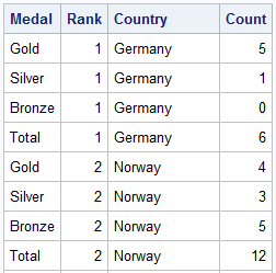
The attention of the world is now on Sochi and the Winter Games.  Gold, Silver and Bronze medals are being earned by these amazing athletes, and everyone has an eye on the tally.  Andre sent me a link to TRinker's R Blog, showing a graph of the current tally.  Andre

Data Visualization
Sanjay Matange 10
Survival Plot

One of the most popular graph amongst clinical and pharmaceutical users is the Survival Plot as created from the LIFETEST Procedure.  This is one graph that users most often want to customize.  See Creating and Customizing the Kaplan-Meier Survival Plot in PROC LIFETEST - Warren F. Kuhfeld and Ying So, SAS Institute

Data Visualization
Sanjay Matange 21
Broken Axis

In my previous post I described the new Polygon plot statement that is included with the SAS 9.4M1 release.   So, a valid question is - what is my motivation for discussing the new features in SAS 9.4M1 when most users are at SAS 9.3 or SAS 9.2 versions?  Here are a

Data Visualization
Sanjay Matange 3
Survey Charts

Often we have situations where the category values on the graph have long character strings.  This is often the case when graphing survey responses to questions.  The questions may be sentences, sometimes moderately long. With SAS 9.4, GTL and SG now support the ability to display tick values split over

Data Visualization
Sanjay Matange 3
Graphs at WUSS - Part 1

It is always a pleasure to attend SAS user conferences, regional conferences and in-house events.  In addition to presenting papers, seminars and super demos to the attendees myself, my favorite activity is to attend presentations by users that include graphical data visualization.  These include using SG procedures, GTL, Designer or SAS/GRAPH.  This year

Data Visualization
Sanjay Matange 9
R U Graphing with SAS?

In recent conversations with many SAS users at NESUG, SESUG and WUSS, a pattern emerges on the question of creating graphs with SAS or R.  Many SAS users are aware of the new graph features in SAS that create high quality graphs with minimum fuss.  But, many have not actually used

1 3 4 5 6 7 10