Graphically Speaking
Data Visualization with a focus on SAS ODS Graphics
Advanced ODS Graphics: Equated Axes and the Aspect Ratio
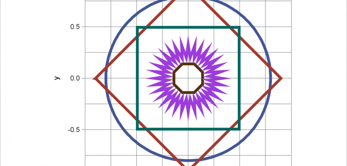
When displaying maps, geometric shapes (such as circles), or results of certain analyses, it is important to equate axes. This post illustrates options in PROC SGPLOT that enable you to equate axes.

Lollipop Charts
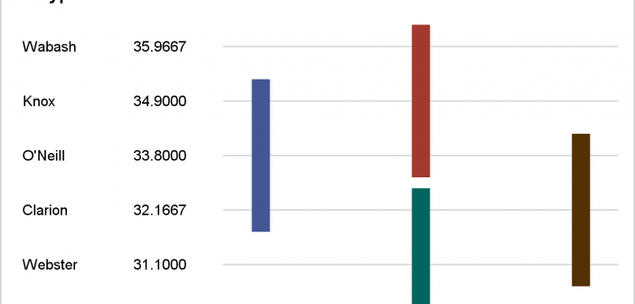
Recently, while reading up on Wilkinson and Cleveland Dot plots, I saw this excellent article by Xan Gregg on the topic. I also saw some interesting examples of Lollipop Charts, kind of a dot plot with statistics along with a drop line, maybe more suitable for sparse data. I thought

Basic ODS Graphics: Enabling, Selecting and Displaying Graphs
This post presents some basic aspects of ODS Graphics: enabling, selecting, and displaying graphs.

