Graphically Speaking
Data Visualization with a focus on SAS ODS Graphics
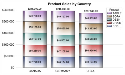
Once in a while you run into a pesky situation that is hard to overcome without resorting to major surgery. Such a situation occurs when you have a stacked bar chart with a discrete legend positioned vertically on the side of the graph. A simple example is shown below. title

When a plot is classified by one or more variables, the different classes values are displayed in the graph either by position or by using different plot attributes such as color, marker shape or line pattern. For plots that display the visual by a filled area (bar, bin, band, bubble,

Plot statements included in the graph definition can contribute to the legend(s). This can happen automatically, or can be customized using the KEYLEGEND statement. For plot statements that are classified by a group variable, all of the unique group values are displayed in the legend, along with their graphical representation
