Graphically Speaking
Data Visualization with a focus on SAS ODS Graphics
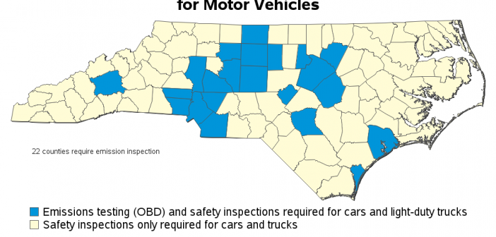
If you live in North Carolina, chances are you have to get your vehicle inspected each year, before you can renew your license plate. The inspection consists of a safety portion, and in some counties an emissions portion. In the past, 48 of NC's 100 counties required the emissions portion

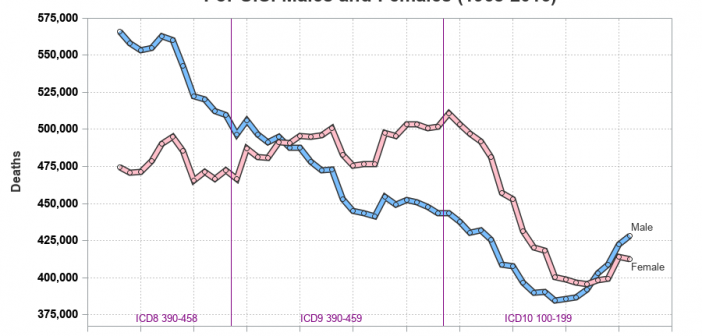
I have written several blog posts about longevity, and here is another one related to that topic. Cardiovascular disease (cvd) is one of the more common causes of death, and I was wondering how those numbers have changed over time. Are fewer people dying from cvd, or are more people

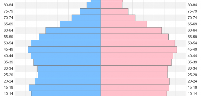
With the US census coming in 2020, I've decided to sharpen my skills at graphing census data. And today I'm working on creating a population pyramid chart to analyze the age and gender distribution. Follow along if you'd like to see how to create such a chart ... or jump
