Graphically Speaking
Data Visualization with a focus on SAS ODS Graphics
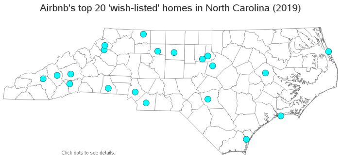
As the sharing economy grows, you can catch a ride on Uber, have meals delivered by Grubhub ... and even stay in someone else's house (rather than a hotel) via sites like Airbnb. And speaking of that last one, I recently read an article listing Airbnb's top 20 'wish-listed' homes

In these modern times, my utility bill has a bar chart so I can see how my current consumption compares to my historical usage. I decided to create my own version of this utility bill bar chart, and make a few improvements along the way. If you're into SGplot bar

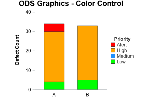
In this 'Rosetta Graph' example, I demonstrate how to control bar chart colors in Gchart and SGplot. But first, here's a little diversion... some artwork in my office here at SAS. There's a *lot* of artwork hanging around at SAS, but this particular painting wasn't created by the SAS artists
