Graphically Speaking
Data Visualization with a focus on SAS ODS Graphics
There are many ways to add more "visual impact" to your maps. Some techniques grab the users' attention, but often don't add anything useful to the message the map is trying to convey (such as 3D tricks, or flashy/gratuitous images and infographics). I encourage you to design maps that have

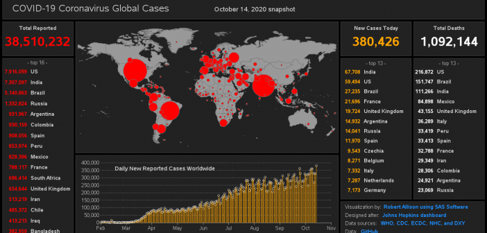
The COVID-19 Coronavirus outbreak has been in the news a lot lately, and everyone is probably looking for a quick/easy way to see the data. The best visualization I've seen so far is this dashboard by Johns Hopkins. Here's a screen-capture: But before we dive into the data analysis, let's

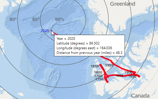
I've read several articles that mentioned the north magnetic pole has been moving more in the past few decades, than in the previous few hundred years. And as a Map Guy, I knew I just had to plot this data on a map, and see it for myself! I provide
