Graphically Speaking
Data Visualization with a focus on SAS ODS Graphics
Calendar Heatmaps are an interesting alternative view of time-series data. The measured value is displayed as color mapped cells in a calendar. Calendar Heatmaps can be easily created with SAS 9.3 using just the HEATMAPPARM, SERIESPLOT and BLOCKPLOT statements in GTL and some simple data manipulation. The example below shows

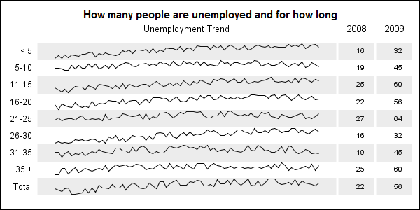
When viewing time series data, often we only want to see the trend in the data over time and we are not so concerned about the actual data values. With multiple time series plots, forecasting software can find clusters to help us view series with similar trends. Recently I saw a graph showing the trend of unemployment

The dimensions of your graph can affect the aspect ratio, which in turn, can subtly affect the perception of your viewers. When visual perception is of prime importance, the aspect ratio of the graph needs to be adjusted with care. This technique is known as ‘banking’, was introduced by William


