Graphically Speaking
Data Visualization with a focus on SAS ODS Graphics
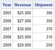
A user recently posted a question in the SAS communities forum about how to best display two measures by one classifier using a Bar-Line graph, where the scale of the two measures is vastly different. This got me thinking about various different ways to represent such data. Here are some of my thoughts,

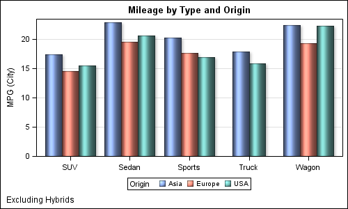
The topic of cluster groups comes up often. By cluster group I am referring to the feature in bar charts where the group values are displayed side by side. With SAS 9.3, SG Procedures support stack or cluster grouping for Bar Charts and overlay or cluster grouping for all other

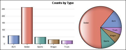
ODS Graphics system was initially motivated by the need for high quality graphs for SAS Base, STAT, and other analytical procedures. Use of SG Procedures, ODS Graphics Designer and GTL by users too has initially focused on analytical graphs. But just like wheels on carryon bags that started for the specific needs of flight
