Graphically Speaking
Data Visualization with a focus on SAS ODS Graphics
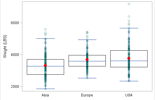
At the 2012 SAS Global Forum, one of the questions from a user was about showing the original data used for the box plot. While you can use outliers in conjunction with the box features to get a feel for the data, for some situations you may need to see exactly

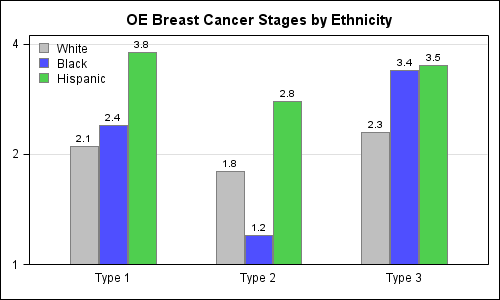
Recently I posted an article on this blog on how to create bar charts with log response axes in response to a question by a user. This generated some feedback suggesting that bar charts should not be used with log response axes or with a baseline of anything other than

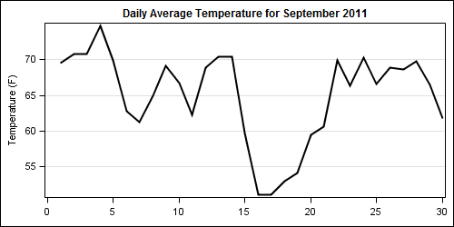
Getting the axis values just right generally requires some work, and the values you want can change from case to case. One such example was discussed by Dan Heath in his post on custom axis values. Here Dan shows the usage of non uniform axis values using the VALUES option on

