Graphically Speaking
Data Visualization with a focus on SAS ODS Graphics
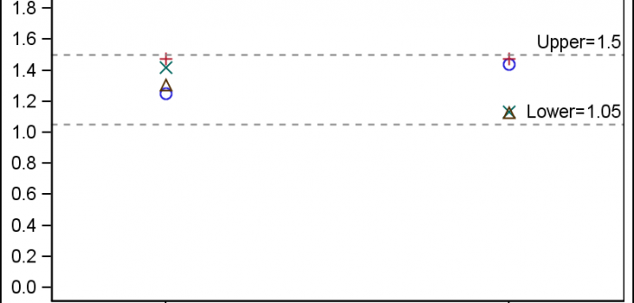
In the Clinical Research domain, there is often the need to display lab values by treatment or test and it is often useful to view this data along with reference lines showing the normal ranges. The obvious way is to use reference lines to denote the normal ranges. SGPLOT Code: proc sgplot data=band; scatter x=x y=y

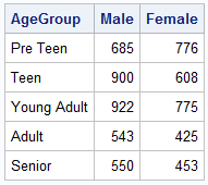
When comparing results by category and group, putting the items to be compared close together usually leads to a graph that is easier to decode. Take the case of the data (simulated) shown below. Here we have population by age group and sex. To compare the population by sex, it is

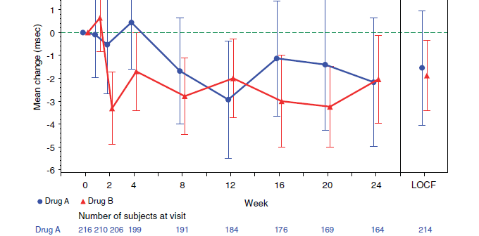
A key element of graphs used for analysis of safety data for clinical research is the inclusion of statistical data (or tables) about the study that are aligned with the x axis of the graph. A common example of this comes from the paper "Graphical Approaches to the Analysis of
