Graphically Speaking
Data Visualization with a focus on SAS ODS Graphics
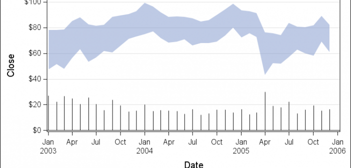
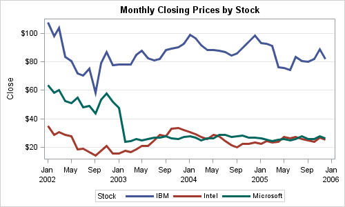
Recently my boss came across a graph where a time series plot was modified to include a "thickness" response. We wondered if this would be a good addition to the GTL / SG Series plot statement. What would the result look like, and what are the pros and cons? So, I took up

SAS 9.4 was released a month ago, and we are excited about all the new features in SG Procedures, GTL and Designer. I wrote an article on SAS 9.4 graph features last month, and promised more to come. What then could be better than this Tech Talk video hosted by our

The graphs produced by the SG procedures (and GTL) have a default look and feel designed for the common use cases. However, everyone has a preference for some special features that make the graphs unique. Fortunately, extensive customizations can be made to graphs produced by these tools using statement and
