Graphically Speaking
Data Visualization with a focus on SAS ODS Graphics
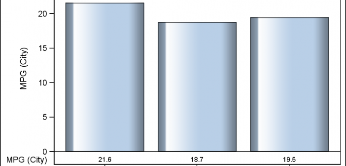
Creating a Bar Chart with a table of statistical data aligned with the bars is a popular topic. With SAS 9.4, creating such graphs gets easier with the new AXISTABLE statement in GTL and SG procedures. But some use cases can flummox the latest gizmos. Such is the case I ran into recently. Here

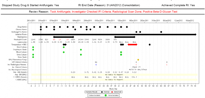
Last week I covered some of the interesting graph-related papers presented at WUSS. There were quite a few, so I broke up the report into two parts. Here is the second installment. In the paper Creating Graphical Patient Profiles using SAS by William Garner of Gilead Sciences, the author describes how to create

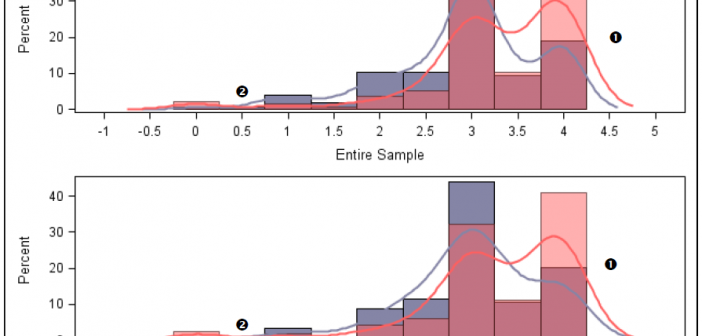
It is always a pleasure to attend SAS user conferences, regional conferences and in-house events. In addition to presenting papers, seminars and super demos to the attendees myself, my favorite activity is to attend presentations by users that include graphical data visualization. These include using SG procedures, GTL, Designer or SAS/GRAPH. This year
