Graphically Speaking
Data Visualization with a focus on SAS ODS Graphics
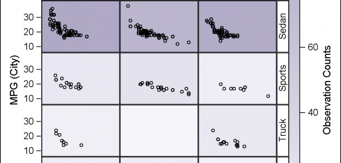
Classification panels are a very popular visual representation of the data, where the data is gridded by class variables all in one graph. This makes it easy to compare and contrast the data by these class variables. The SGPANEL procedure makes this easy, and most of the time it is

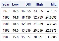
Browsing graphs on the web, this graph caught my eye: The Arctic Sea Ice Volume Graph. My interest is not so much in the debate on Climate Change or Global Warming. To me, this graph has some interesting features that can help show the benefits of plot layering to

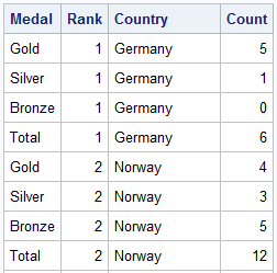
The attention of the world is now on Sochi and the Winter Games. Gold, Silver and Bronze medals are being earned by these amazing athletes, and everyone has an eye on the tally. Andre sent me a link to TRinker's R Blog, showing a graph of the current tally. Andre
