Graphically Speaking
Data Visualization with a focus on SAS ODS Graphics
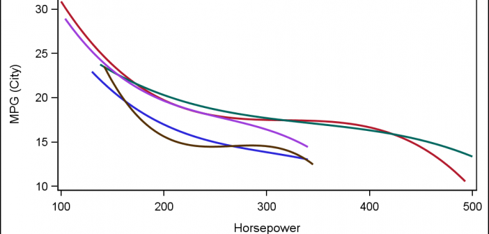
Often, the topic of an article is motivated by a question from a user. A satisfactory resolution of the situation is usually a good indication of a topic that may be of interest to other users. On such question was posed to me by a user this weekend. He wanted to display fit

When you hear of a Scatter Plot or a Series Plot, you have a picture in your mind what we are talking about. But one of the plot statements available in GTL, and soon with SGPLOT, is the BLOCK plot. I am sure this leaves many users scratching their heads, wondering

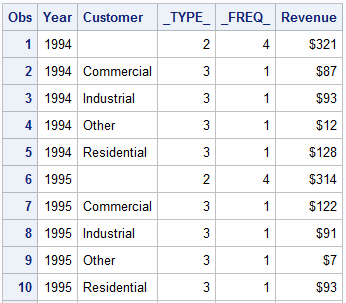
The GCHART procedure has a popular option called G100 to display all the subgroups in % format such that all the subgroup values add up to 100% for each group. Each subgroup is labeled with its own % values. SGPLOT procedure does not such an option, but with a little bit of
