Graphically Speaking
Data Visualization with a focus on SAS ODS Graphics
This article is by guest contributor Lelia McConnell, SAS Tech Support. Several users have called recently to ask the question, “Can I reorder the legend entries on the bar chart that I created with PROC SPLOT?” Although there is no option that does this directly in PROC SGPLOT, the answer

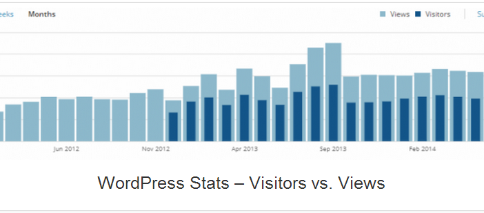
A couple of days back, Rick Wicklin forwarded me a link to an article on the BadHessian Blog on creating a Bar Chart using six different freeware packages in R, Python and Julia. The target bar chart was one produced by the Jetpack stat module with WordPress. The graph is shown below. The unique feature of

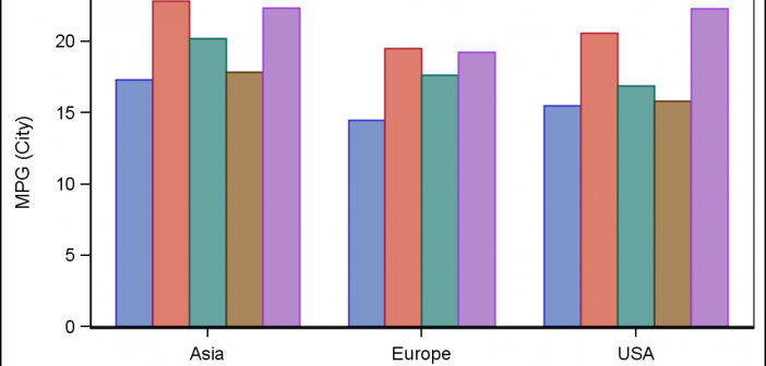
This post could be titled something like "Everything you wanted to know about Group Order in GTL - and more." The group ordering shows up in three different ways in your graph. Assignment of attributes (color, marker symbol) to group values. Position of group values in the graph. Display of the group
