Graphically Speaking
Data Visualization with a focus on SAS ODS Graphics
All axis customization features are always welcome. Especially since SGPLOT statements can often be used to create non standard graphs, having the ability to customize the axes is important. This article presents ways in which you can customize the discrete axes. By default, the x axis will try to display the

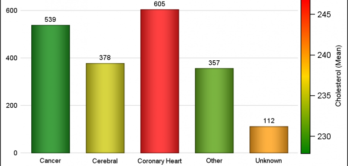
Often there is a need to display more than one response simultaneously for a bar chart, series plot or a vector plot. SAS 9.40M3 adds the options you need to get such results using two new options COLORRESPONSE and THICKRESPONSE where applicable. The Bar Chart on the right shows the frequency

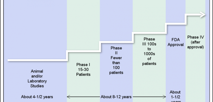
The SGPLOT procedure provides great tools to create all kinds of graphs for all domains from business to clinical. However, every so often, we need to create visuals that are not exactly graphs, but more like flow or network diagrams, or something entirely unique. Some users may have tools to
