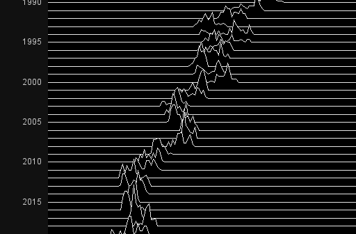
When it comes to plotting mortgage rate data, I often look to Len Kiefer for inspiration. He recently posted a retro-looking graph on twitter that caught my eye ... and of course I had to see if I could create something similar using SAS. For lack of a better term,
English
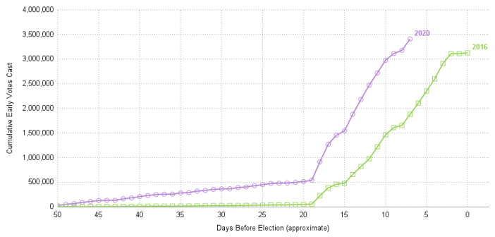
Here in the United States, we have our general election (where we elect the president) every four years - and 2020 happens to be one of those election years. This time we seem to have a lot more people voting early. I can't tell you the reason they're voting early
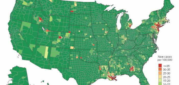
Now that we are many months into the COVID-19 pandemic, we can start to reexamine the data and look for trends. This time, I want to explore how COVID-19 has been spreading around the US. I do this by animating a county map over time. What is animation? Are you
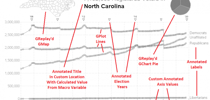
When an election is on the horizon, I always feel compelled to plot some data! And this time I'm plotting North Carolina's voter registration data! State Data For this graph, I downloaded several of the data snapshots from the NC State Board of Elections' website, and plotted a line showing
Now that we are many months into the COVID-19 pandemic, I've started going back and reexamining the data for lessons or trends (you might say hindsight is 20/20). This time, I want to explore how COVID-19 has been spreading around the US. I do this by using a graphical idea
When you get something new, the hope is that it will be better than the old thing it's replacing. As I often do, I asked my Facebook friends to provide a random picture for my blog - in this case, a picture of one of their new/recent purchases. My friend
During the 2020 Coronavirus pandemic, you've probably formed a great appreciation for good, informative graphics. Good graphics can help you get a handle on thousands of individual data values, see the geographical distribution, or look for trends. In February, I wrote a blog post about creating a coronavirus dashboard with
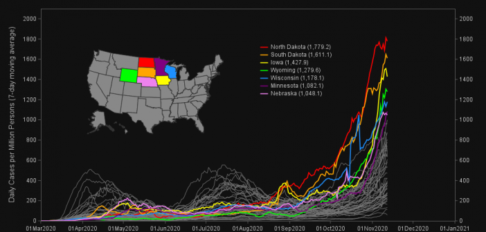
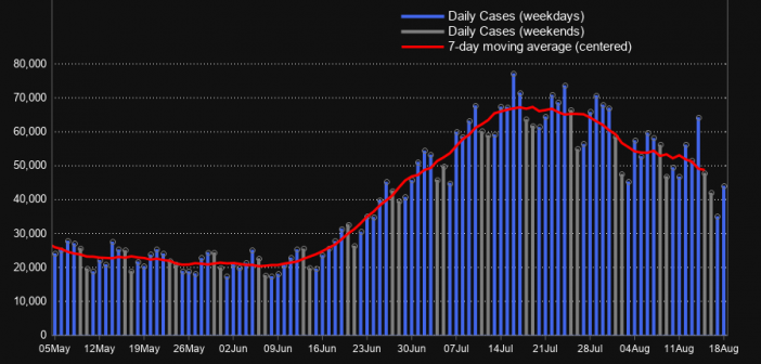
If you're close to my age, you probably remember Joe Walsh's song Ordinary Average Guy. That song popped into my head when I was writing this example about moving averages, so I encourage you to listen to it while reading the blog post. Many people are looking at graphs lately
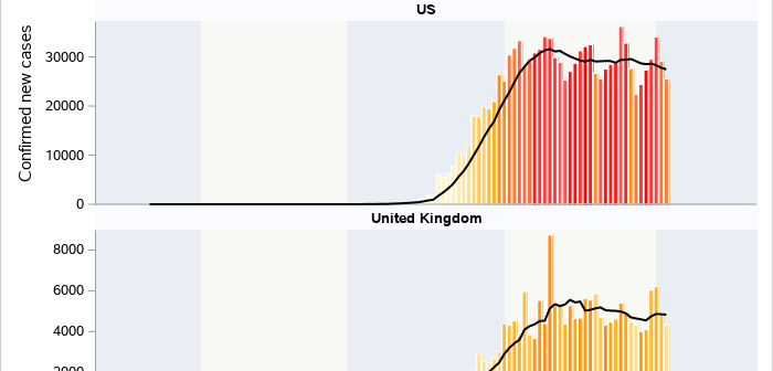
As we continue to process and understand the ongoing effects of the novel coronavirus, many of us have grown used to viewing COVID-19 dashboards and visualizations, including this popular coronavirus dashboard from SAS. If you are more accustomed to building graphs and visualizations using the SGPLOT and SGPANEL procedures, this
Now that COVID-19 is spreading in the US, I thought it might be helpful to view the data at a more granular level. Follow along as I plot the county data on a map and discuss how the color-binning can influence people's perception of the data. Maps like this can