Lake Superior is the largest freshwater lake (by surface area) in the world. And its largest island is Isle Royale. And its largest lake is Lake Siskiwit. And its largest island is Ryan Island. Ryan Island's largest (seasonal) pond is called Moose Flats. And it contains an 'island' (or a
English
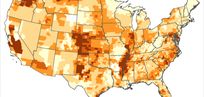
I think one of the great uses of analytics and graphics is to show things like cancer clusters on a map. There are many factors that can lead to a higher incidence of diseases in geographical areas, and chemicals are often the culprit. For example, paraquat has been potentially linked
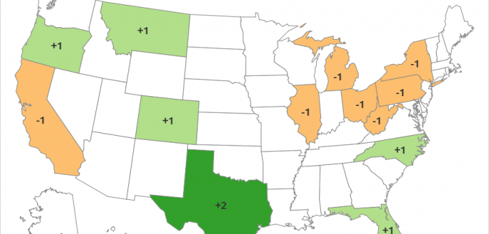
Every 10 years the United States conducts a Census where we count all the people. This week the 2020 Census population totals for each state were released. And how might these numbers affect you? ... One thing the Census numbers are used for is to determine how many of the
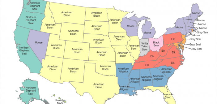
Everybody likes to learn a bit of interesting trivia... It could make you look smart, or might help you win a bet in a bar. Or maybe give you something to amaze your kids with. Do you know what's the biggest non-domesticated land animal in your state? How about all
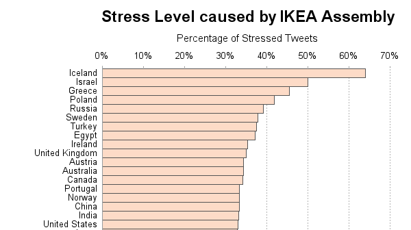
Have you ever brought home a piece of furniture-in-a-box, and felt undue stress while trying to make sense of the directions to assemble it? ... Apparently you're not alone! A recent analysis studied ~50,000 tweets about IKEA furniture, and determined whether the people posting the tweets were frustrated. They then
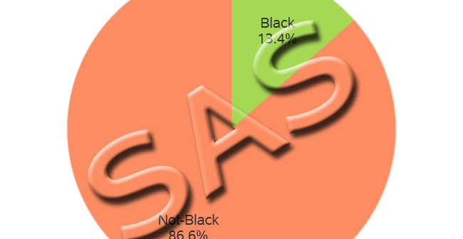
This is another in my series of blog posts where I take a deep dive into converting R graphs into SAS graphs. Today we'll be working on pie charts. I know, I know ... you visualization 'purists' might be wagging your finger at me, and saying "pie charts are no good."
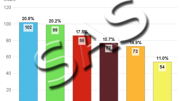
This is another in my series of blog posts where I take a deep dive into converting customized R graphs into SAS graphs. Today we'll be working on bar charts ... And to give you a hint about what data I'll be using this time, here's a picture from a SAS
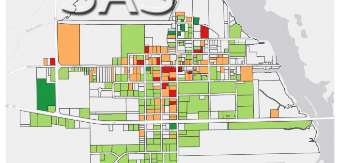
This is another in my series of blog posts where I take a deep dive into converting customized R graphs into SAS graphs. Today we'll be working on shapefile maps ... And what data will we be using this time? Here's a hint - the picture below is the Aurora
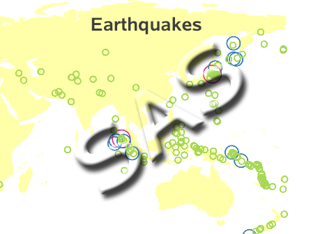
This is another in my series of blog posts where I take a deep dive into converting customized R graphs into SAS graphs. Today we'll be working on bubble maps - specifically, plotting earthquake data as bubbles on a map. R bubble map, created using geom_polygon() and geom_point() SAS bubble
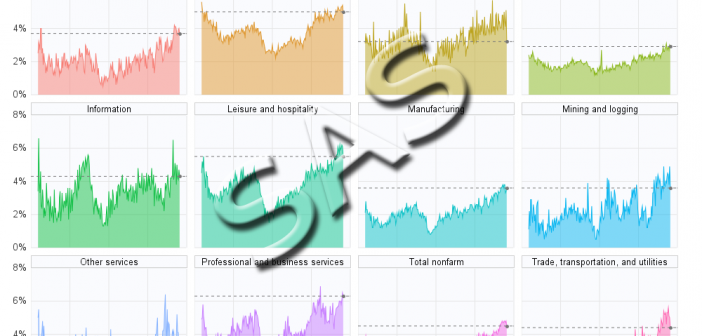
This is another in my series of blogs where I take a deep dive into converting customized R graphs into SAS graphs. Today I show how to combine several graphs with shared axes, which we'll call paneled graphs. This time I'll be plotting the Job Openings Rate by Industry, similar