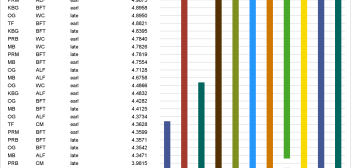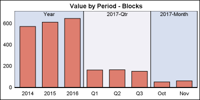
Off and on, users have expressed the need to include multiple blank categories on a discrete axis. Often, this is desirable to separate groups of bars (or categories) in a graph due to some difference their definition. Such a case was discussed in this blog article on using non breaking
English
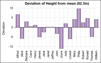
ODS Graphics procedures primarily strive towards the following goal: "Make simple graphs easy and complex graphs possible". SGPLOT procedure allows you create simple graphs with a single plot statement, and create complex graphs by layering together or combining multiple plot statements. Generally, the appearance follows the guidelines set by industry
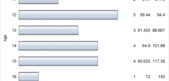
Axis tables can use the SUM= option to summarize data and display means, medians, sums, and percentages. They can instead be used to display data, text, and statistics without any summarization.
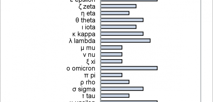
This post provides a general macro that enables you to easily display special characters (Unicode) in axis table columns.
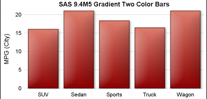
SAS 9.4 maintenance release 5 was released on Sept 19, 2017. This release includes many new items including integration with SAS Viya and SAS Studio, a web application for SAS development. Also Included with this release are some cool new features in the graphics domain, some of which were requested
In PROC GLM and most other procedures that compute LS-means, mean comparisons are now displayed graphically. This makes comparisons between a large number of groups easier to interpret.
On a recent visit to an In-House Users Group meeting at a Pharmaceutical company, I presented a 1/2 day seminar on creating Clinical Graphs using SG Procedures. Polling the audience for their experience with these procedures indicated that many SAS users are not familiar with these new ways to create graphs. So,
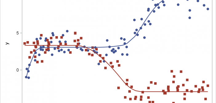
This post shows how to use PROC SGPLOT together with PROC TRANSREG to fit monotonically increasing or decreasing functions through a scatter plot.
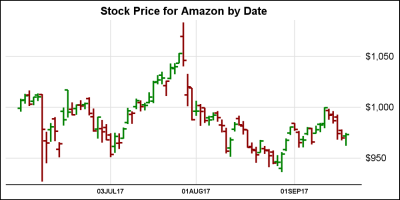
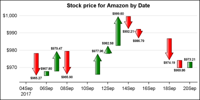
In the previous article on Getting Started with Vertical HighLow Plot, I described how we can use the HighLow plot to display the stock price by date. The HighLow plot is specifically designed for such use cases as shown below. The data is downloaded from the Nasdaq web site, and
This is the 7th installment of the Getting Started series. The audience is the user who is new to the SG Procedures. Experienced users may also find some useful nuggets of information here. Starting with SAS 9.3 which was released 6 years ago, the SGPLOT procedure supports many new plot types including